
Visual Identity // Logo Redesign // Brand Messaging
CORK N THINGS
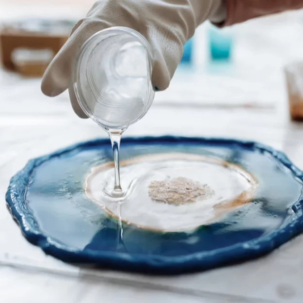
Project Overview
This rebranding project for Cork N Things aimed to refine the company’s identity by updating its logo, color palette, and typography. The objective was to better align the brand with its core values while creating a more modern and approachable image. A key focus was on enhancing brand messaging to foster a stronger emotional connection with the audience through a relatable and consistent tone.
SERVICES
Logo Redesign
Color & Typography System
Brand Messaging Framework
Marketing Strategy Support
Visual Identity Refinement
Web & Editorial Brand Integration
OLD LOGO
New Responsive Logo Identity
BRAND PURPOSE

Mission Statement
Introducing a world of artistic innovation and personalized craftsmanship, Cork Creativity, Resin Imagination, and creations made just for you.
At Cork Creativity, we believe in turning the Ordinary into the extraordinary. Our artisans harness the natural beauty of cork, a versatile and sustainable material, to craft exquisite pieces that transcend conventional design. Each creation is a testament to the fusion of nature’s charm with human ingenuity.

GUIDING PRINCIPLES
Brand Values
Innovation
We believe in transforming the ordinary into the extraordinary. By embracing creativity and experimentation, we push the boundaries of design, ensuring each piece reflects fresh ideas and artistic imagination.
Craftsmanship
Every creation is made with care, precision, and passion. Our artisans honor the tradition of handmade work, blending skill and artistry to deliver pieces that feel personal and timeless.
Sustainability
Cork is at the heart of what we do—a renewable, eco-friendly material that allows us to design responsibly. We are committed to protecting the planet while crafting beautiful, enduring works.
Authenticity
Each piece is a true reflection of individuality and nature’s charm. We stay genuine in our process, creating meaningful designs that connect deeply with the people who experience them.

BRAND TONE / THEMES
Logo Development
Sketch
In these sketches, I explored combining the first initials “C” and “T” in abstract ways to form a unique, memorable mark for Cork N Things. Several concepts incorporate branching forms or symmetrical elements inspired by trees, symbolizing natural growth and balance. The goal was to create a logo that feels both organic and elegant, reflecting the brand’s connection to nature and lifestyle.


Iterations
These early iterations didn’t make it to the final cut, but they played a crucial role in shaping the direction of the brand. By experimenting with letterforms and organic, nature-inspired shapes, I was able to explore the balance between structure and elegance. This process helped clarify the visual language and ultimately led to a more refined and fitting logo for Cork N Things.
Logo Lockup
Stacked Lockup
The stacked version emphasizes boldness and presence, ideal for packaging, signage, or promotional materials. This arrangement highlights the harmony between the icon and the text, creating a compact yet impactful visual identity.
Horizontal Lockup
The horizontal lockup presents a sleek and versatile design, perfect for banners, website headers, and business cards. Its clean alignment communicates balance and professionalism, while maintaining the elegance of the icon paired with the brand name.
Icon Only
The standalone icon captures the essence of the brand in its purest form. Simple yet distinctive, it conveys creativity and sophistication, making it a strong mark for social media, product stamps, or subtle branding elements
Final logo
This final logo for Cork N Things beautifully captures the brand’s essence with a sleek, stylized mark that suggests a blooming flower or a cork bursting open—symbolizing celebration, elegance, and nature. The bold magenta icon is symmetrical and dynamic, creating a strong visual identity that stands out across digital and print platforms. Paired with a refined serif typeface, the logo balances sophistication with personality, making it a perfect fit for a lifestyle or wine-focused brand.
LOGO IN ACTION


