REAL ESTATE WEBSITE REDESIGN
Web Redesign // UX Structure // Brand Presence
Commision Work
SERVICES provided
Web Design & Development
UX Sitemap Planning
Mobile Optimization
Graphic Design Integration
Visual Hierarchy and Navigation
Developed a professional, responsive website for Susan Chen Real Estate, showcasing company branding, services, and contact information. Focused on user experience, mobile compatibility, and elegant design aligned with the company’s identity.
Tools Used
Figma – for wireframing, prototyping, and high-fidelity mockups
Adobe Photoshop – for image editing and preparing visual assets
Square Space - Platform utilized
Challenges with the Original Website
The old website needed a complete redesign due to its lack of functionality, poor search visibility, and outdated design. It failed to engage visitors or generate leads, ultimately hurting the brand’s credibility in a competitive digital market.
Key Issues:
Not properly indexed, resulting in poor search engine visibility
Outdated, unengaging design that made the brand feel less trustworthy
Minimal to no conversion of visitors into leads
High bounce rate, with most visitors exiting within 20 seconds
No clear calls-to-action to guide visitors toward conversions
Confusing navigation that hindered user experience
Weak and unconvincing content that failed to capture interest
Site Map
This site map was created to establish a clear, logical foundation before moving into the wireframe stage. It organizes the main navigation and subpages to ensure content is purposeful, easy to find, and optimized for lead generation.
Key Objectives:
Define clear navigation structure for intuitive browsing
Break content into focused subpages (About, Seller, Buyers, Mortgage Calculator, Contact Susan)
Minimize clutter and improve user focus on key actions
Guide visitors toward high-value goals: requesting consultations, viewing properties, signing up for updates
Provide a blueprint that balances aesthetics, usability, and strategic conversion goals
Wireframe
With the site map as a guide, the wireframe was developed to visualize the layout, hierarchy, and user flow before adding visual design elements. It focuses on clear navigation, strategic placement of calls-to-action, and content organization that drives engagement and conversions.
Key Goals:
Translate the site map into a functional page structure
Prioritize calls-to-action in high-visibility areas
Ensure mobile-first responsiveness and accessibility
Maintain a clean, uncluttered layout for easy scanning
Support lead generation through intuitive user flow
Color Palette
The selected color palette embodies sophistication, trust, and timeless elegance—qualities essential to the real estate luxury market. The white represents clarity, openness, and modern minimalism, reflecting a clean and professional foundation. The gold tone conveys prestige, success, and exclusivity, echoing the refined experience clients expect in high-end property dealings. The black adds depth and contrast, grounding the palette with a sense of confidence and authority. Together, these colors create a visual language that communicates luxury, stability, and high-value service.
Typography
The typography was chosen to balance elegance and modern readability, aligning with the sophisticated tone of a luxury real estate brand. Times New Roman, a classic serif typeface, brings a sense of tradition, professionalism, and trust—qualities that reflect stability and refinement. Almaria, used for body text, offers a clean and contemporary contrast that enhances legibility across digital platforms while maintaining a polished look. Together, these typefaces create a harmonious blend of heritage and modernity, reinforcing the brand’s premium identity.
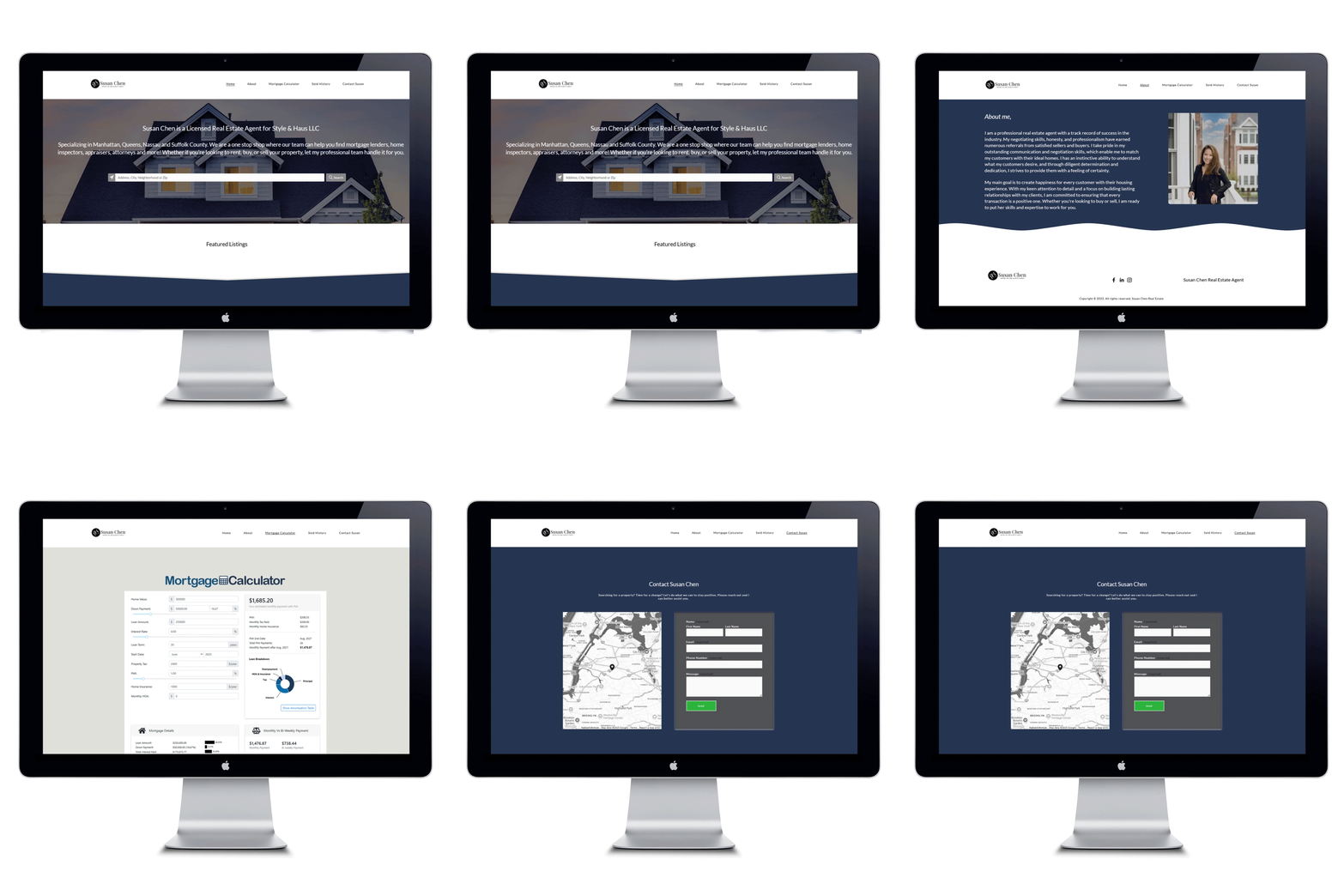
First Iteration – High Fidelity
This stage introduces brand colors, typography, and real imagery to the structural framework established in the wireframes. While not final, it serves as a visual prototype to explore layout, hierarchy, and user interaction in a more realistic context. Feedback from this stage will guide refinements before the final version is produced.
Key Focus Areas:
Apply preliminary brand colors, imagery, and type styles for visual context
Test navigation flow and placement of interactive elements
Evaluate visual hierarchy and content balance across pages
Explore layout variations to improve clarity and engagement
Gather feedback for design, content, and user experience improvements
Identify adjustments needed before moving into the final polished stage
Key Screens
Final Design
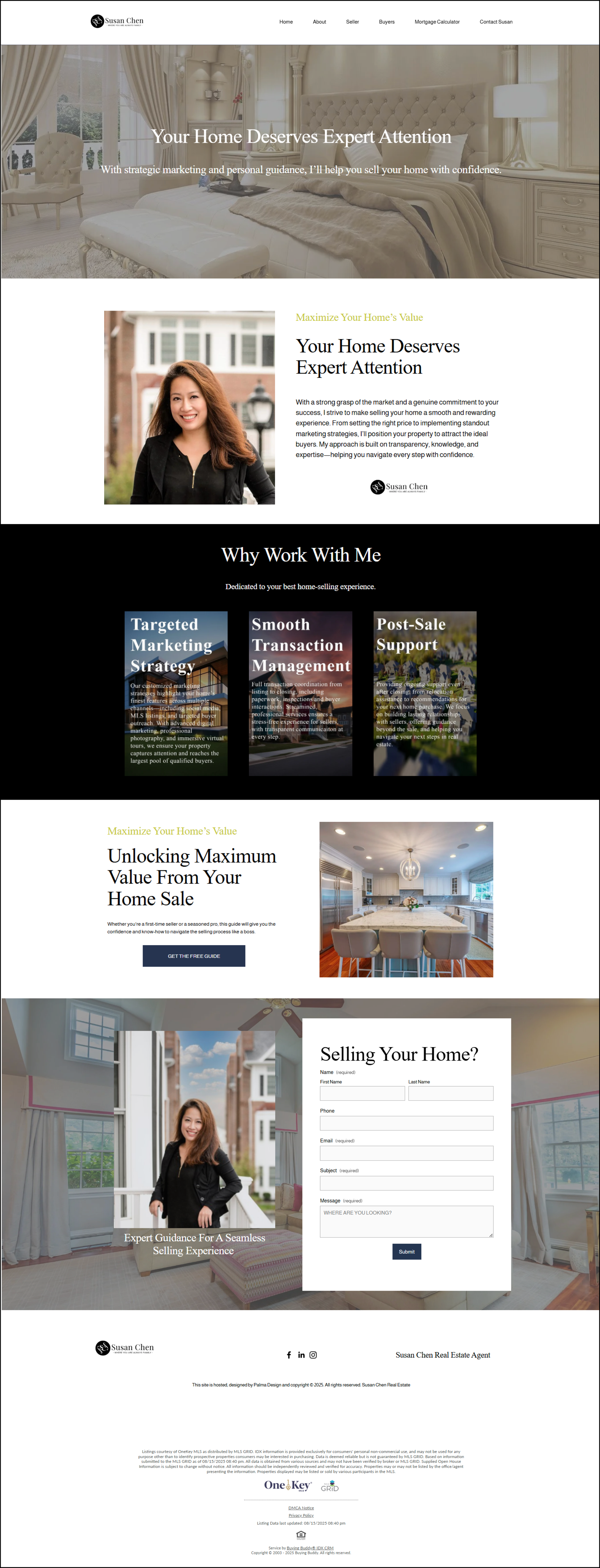
The final design brings together strategy, structure, and brand identity into a cohesive, high-fidelity website. Each page was refined with real content, polished visuals, and a consistent style system to ensure both usability and professionalism. This stage resolves earlier iterations and focuses on clarity, trust, and conversion-driven interactions
Key Highlights:
Home Page – A welcoming hero section with search functionality, service overviews, and recent sales to establish trust and encourage exploration
About Page – Professional imagery and clear storytelling to showcase Susan Chen’s expertise and build credibility
Seller Page – Organized benefit-driven sections (Marketing, Transaction Management, Post-Sale Support) with strong CTAs to drive lead capture.
Buyer Page – Buyer-focused messaging, strategies, and a “Find Your Dream Home” form to streamline lead generation
Mortgage Calculator – An interactive tool to add value for users, improving engagement while supporting informed decision-making
Contact Page – Simple, direct form paired with a location map to make reaching out easy and intuitive
Results & Performance Metrics
After redesigning the client’s website, the analytics revealed a noticeable improvement in overall engagement and user interaction. Visitors were spending more time exploring the site, viewing additional pages, and contributing to an increase in total traffic. These results reflect how thoughtful design decisions directly impacted usability, retention, and brand perception.
Key Points To Explore:
Increased overall traffic and visibility
Improved user engagement and time spent on page
Stronger navigation flow and lower exit rates
Enhanced brand experience and audience retention
User Engagement Insights
The redesigned website led to stronger engagement and clearer navigation patterns. Visitors are spending more time on pages and exploring deeper into the site — signs of improved usability and content flow.
Key Results:
Average Time on Page: 111 seconds — visitors remain engaged nearly 2 minutes per page.
Bounce Rate: 75.6% — typical for informational sites, showing users quickly find what they need.
Exit Rate: 53.1% — over half of users visit multiple pages before leaving.
Takeaway: The redesign successfully increased engagement and improved the browsing experience.
Traffic Growth & Visibility
After the website redesign, analytics showed a significant improvement in overall traffic and engagement. Pageviews increased substantially, reflecting stronger visibility, improved content hierarchy, and clearer navigation that encouraged visitors to explore more.
Key Results:
+137% Increase in Pageviews — from 423 (2024) to 1,002 (2025).
Improved Search Visibility — optimized layout and structure led to higher organic reach.
Better Navigation Flow — users accessed more pages per session, reducing early exits.
Takeaway: The redesign successfully elevated both the site’s performance and user experience, transforming it into a more engaging and discoverable platform.
Try the Prototype
You can experience the interactive prototype directly on this page, or follow the link below to view it in Figma. This gives you the opportunity to click through the design, test navigation, and see how the final website will function in a real-world flow.
Final Design Link


