Chinese
Center of
Long Island.
chinesecenter.org ↗
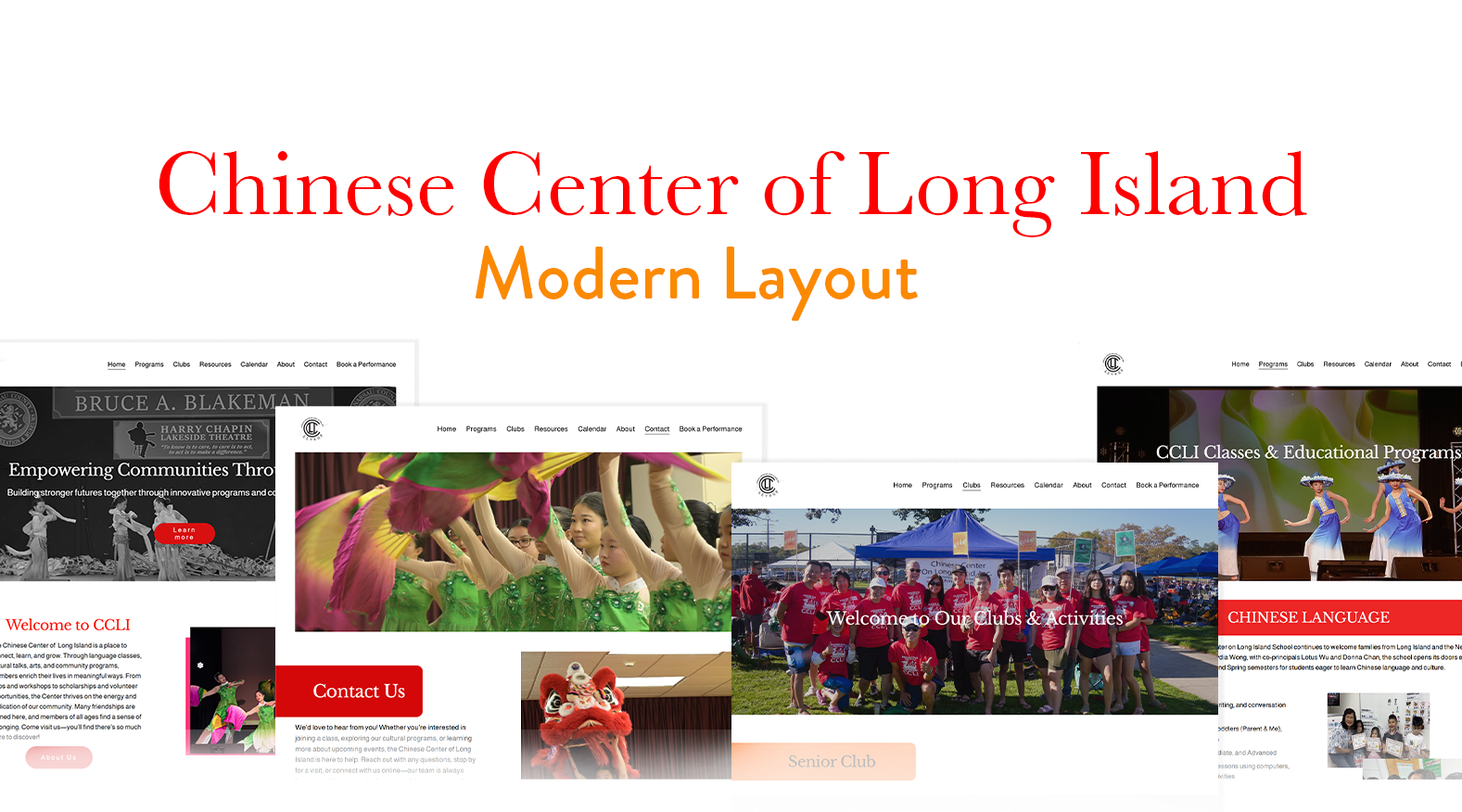
A modern website redesign for the Chinese Center of Long Island — created to reflect the organization's cultural vibrancy, community impact, and educational mission. The layout focuses on clarity, accessibility, and visual storytelling through strong imagery, balanced typography, and an intuitive navigation system.
The design blends tradition with a contemporary aesthetic to present the organization as both culturally rooted and forward-thinking — serving students, families, and community members across Long Island.
Cluttered.
No structure.
The original website lacked visual hierarchy, making it difficult for users to quickly understand the organization's structure and offerings. Programs, clubs, and resources were not clearly prioritized, causing confusion and reducing usability. Navigation was not intuitive, and inconsistent spacing, typography, and alignment left users working harder than they should to find key content.
- No clear visual hierarchy between headings, subheadings, and body text
- Inconsistent typography and spacing
- Overcrowded layout with weak content organization
- Navigation structure was unclear and overwhelming
- Important sections were not visually prioritized
- Limited emotional connection through imagery and layout
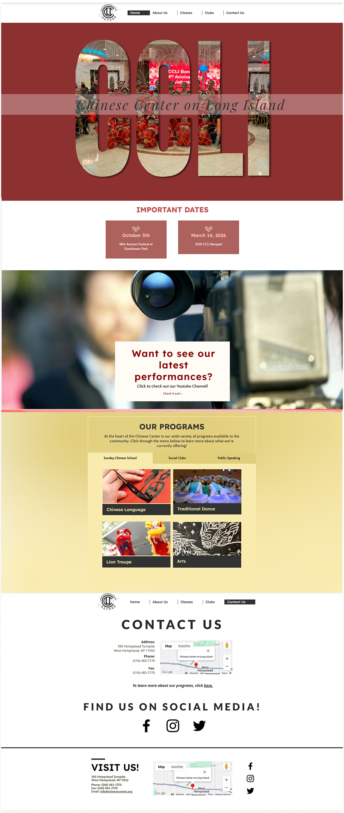 Original site — before redesign
Mapping the structure.
The redesign began with an audit and user research, followed by a restructured information architecture — clarifying navigation and creating direct paths to educational programs and community involvement.
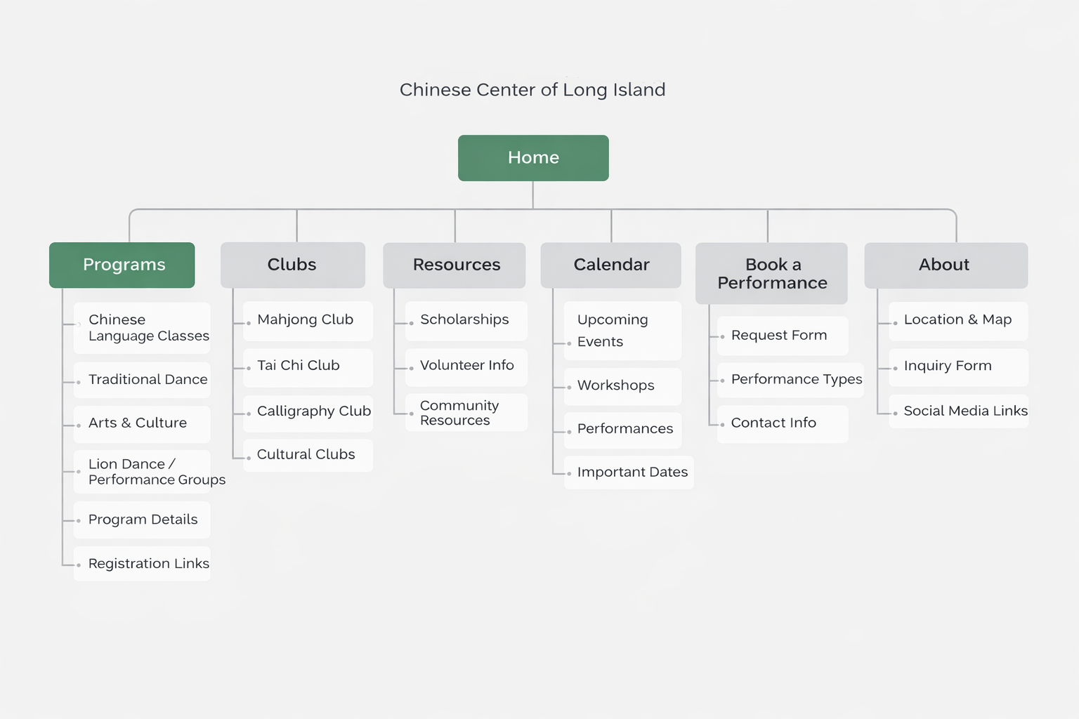 Site map — page hierarchy & user flow
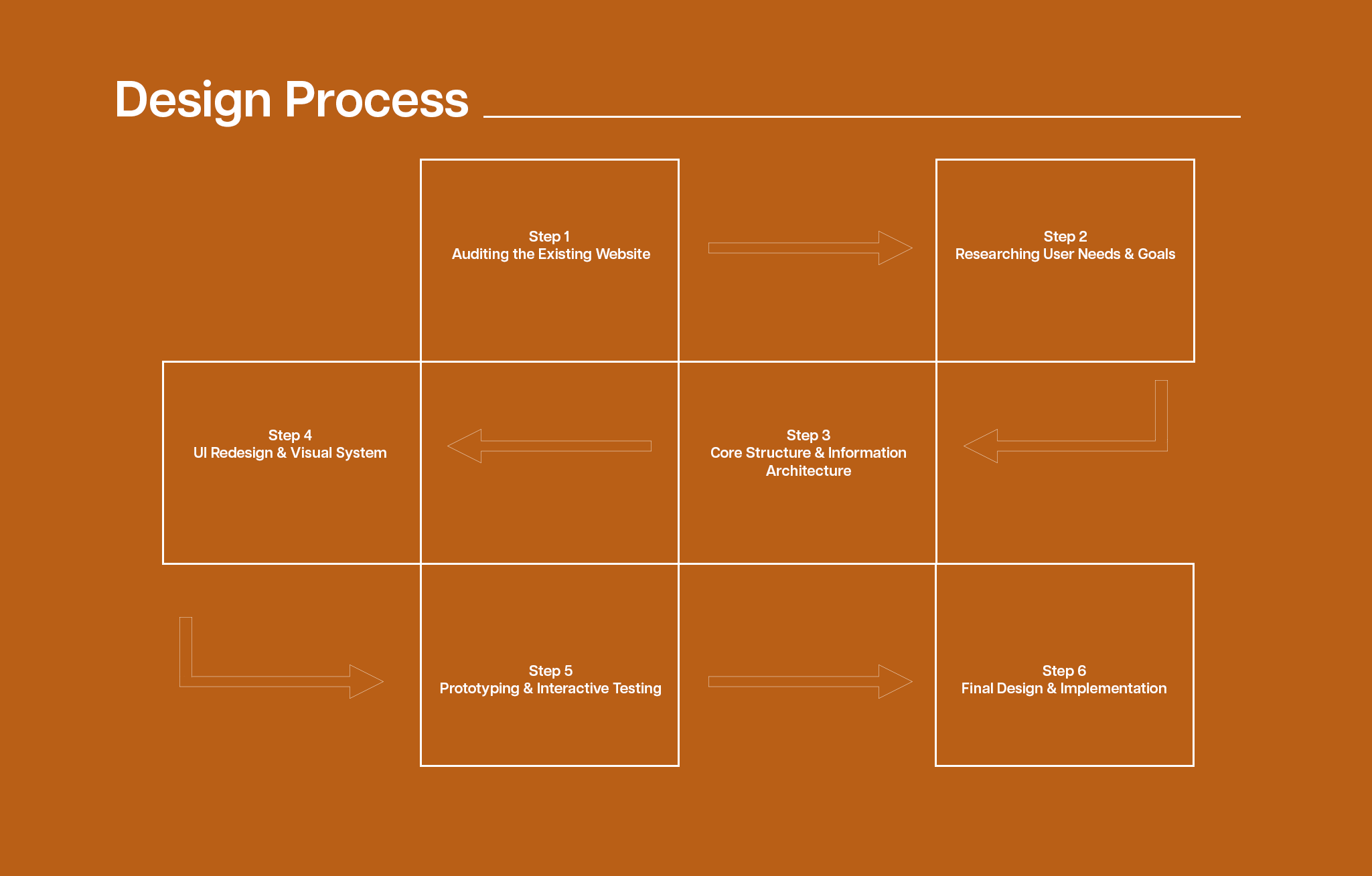 Design process overview
With the site map as a guide, wireframes were developed to visualize the layout, hierarchy, and user flow before adding any visual design. The focus was on clear navigation, strategic placement of calls-to-action, and content organization that drives engagement.
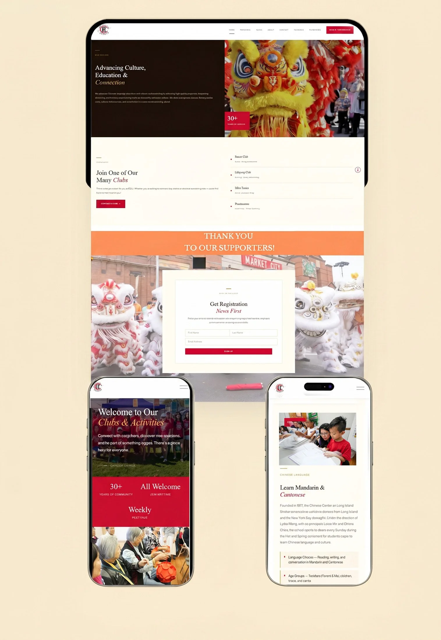
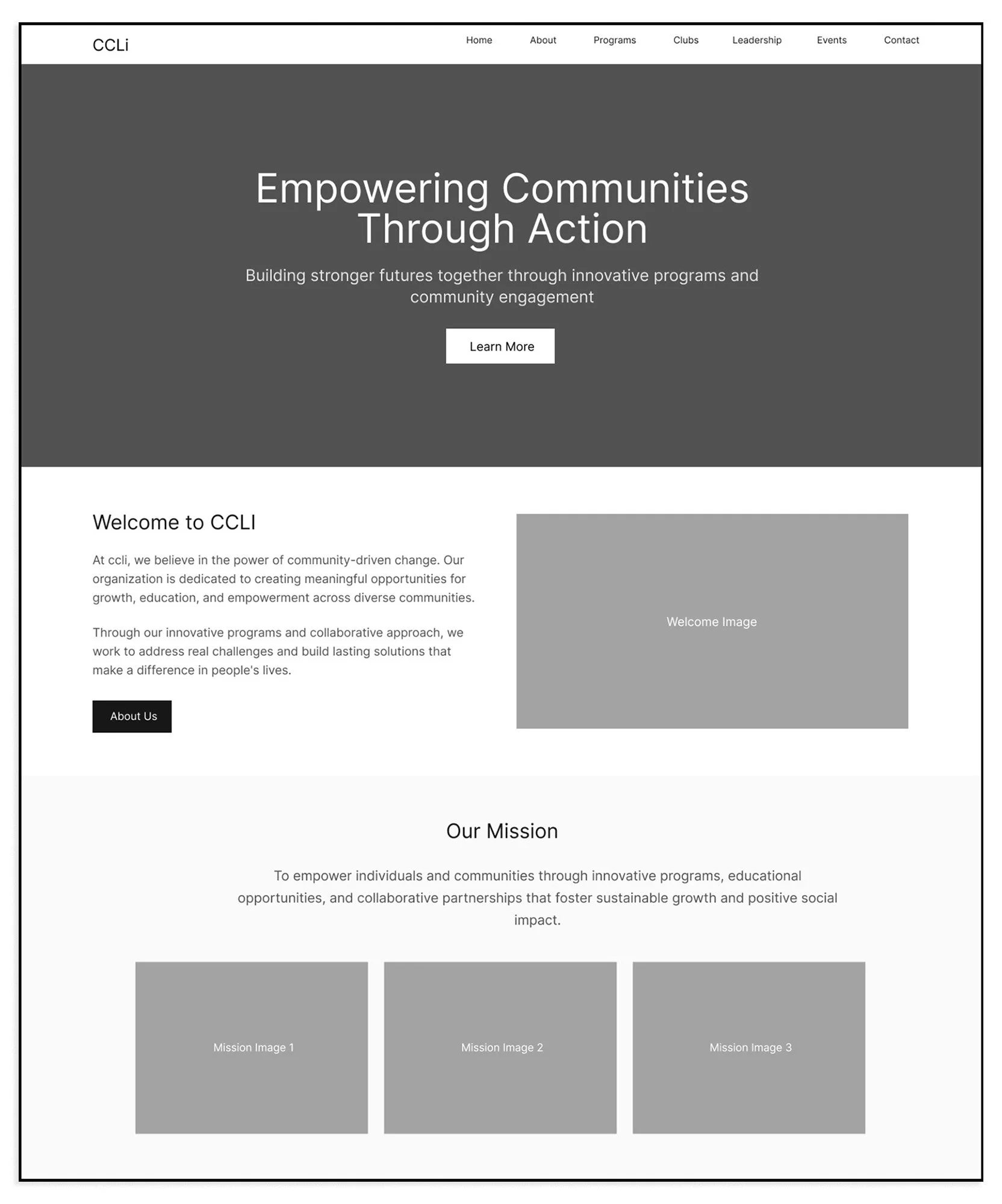 Homepage
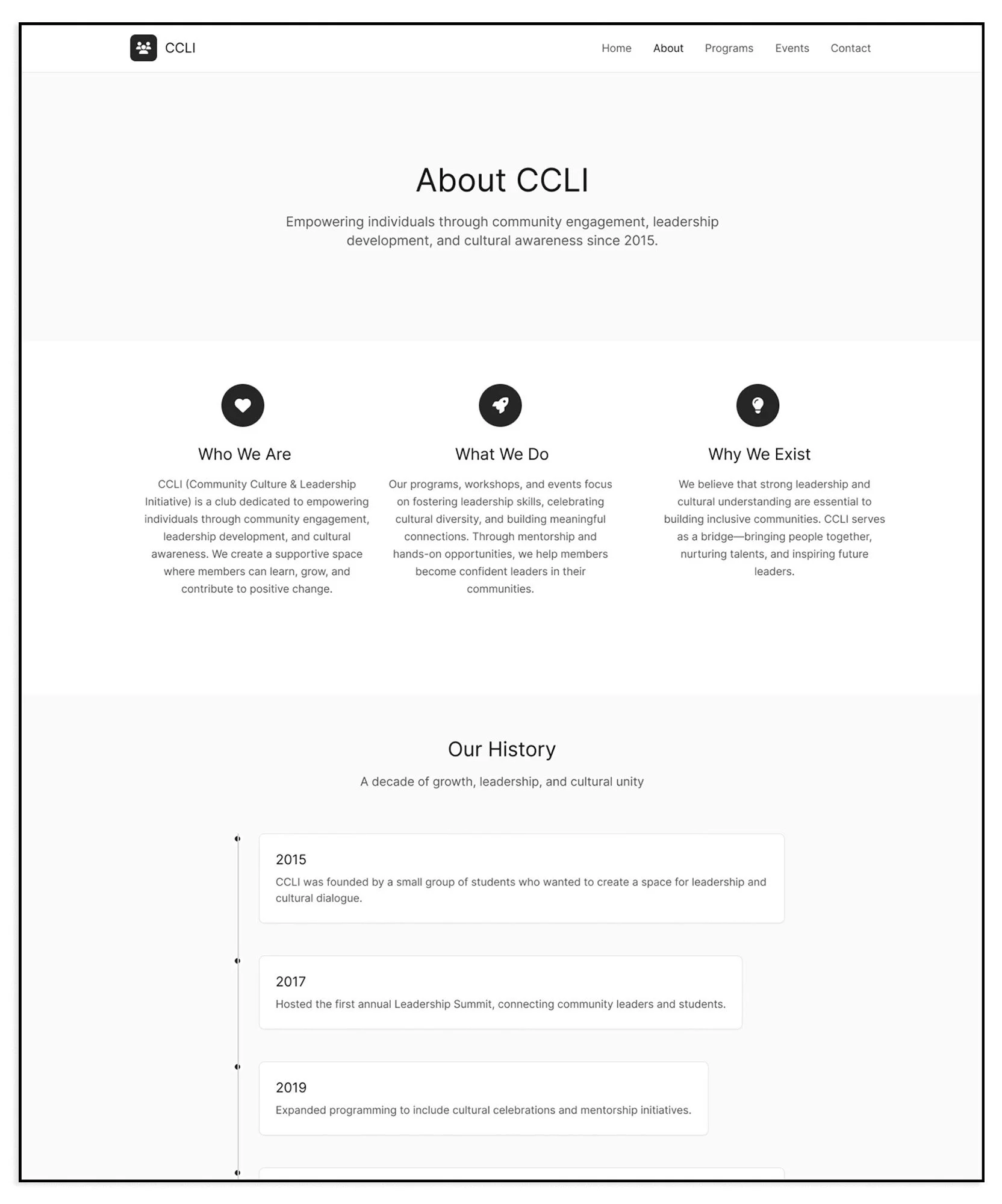 About
About
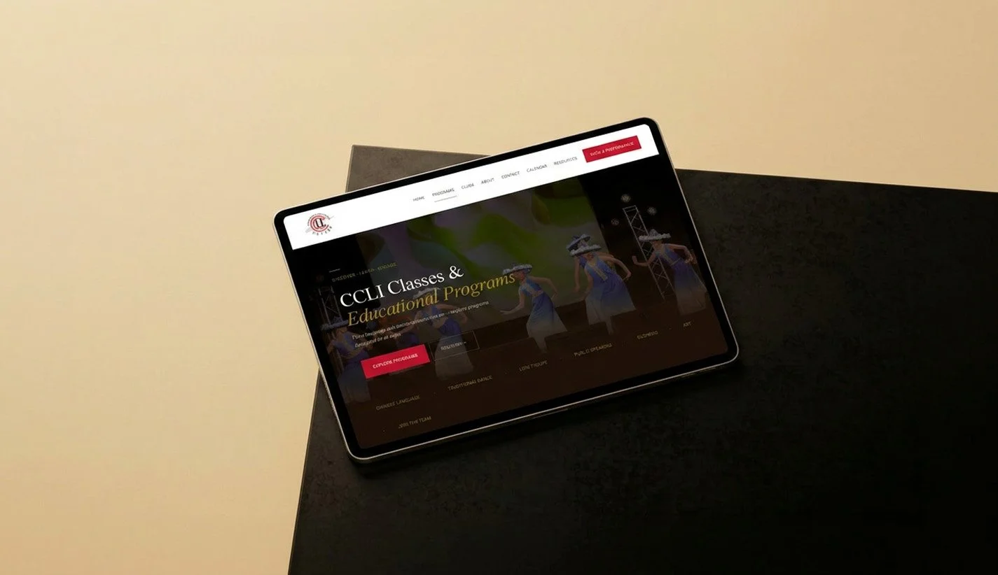
 Programs
The color palette reflects the organization's cultural heritage and community energy. Warm cream evokes openness and welcome, crimson red carries tradition and vitality, gold communicates prestige and celebration, and deep brown grounds the design with warmth and authenticity.
C 0 · M 3 · Y 7 · K 0
C 0 · M 92 · Y 77 · K 22
C 0 · M 18 · Y 77 · K 28
C 0 · M 43 · Y 71 · K 89
Two typefaces were selected to balance cultural depth and modern clarity — each serving a distinct role in the site's visual language.
nopqrstuvwxyz
nopqrstuvwxyz
The finished product.
chinesecenter.org ↗Brand identity, user experience, and strategic structure unified into a cohesive, high-fidelity website — refined with real content, consistent visual language, and intentional hierarchy.
Early analytics revealed strong traffic to Programs and Contact pages — confirming that the redesigned information architecture successfully guided users to key actions.
Direct traffic remained the dominant acquisition channel after launch, while Google search quickly emerged as a strong secondary source — indicating growing organic discoverability.
What I learned.
This redesign reflects my approach to building digital experiences through research, structured information architecture, and performance-driven iteration. Post-launch data confirmed the effectiveness of guiding users toward programs and inquiries, while revealing opportunities to further strengthen event discovery. The project underscored the importance of continuously refining UX decisions after launch and aligning design systems with long-term organizational objectives.