REAL ESTATE WEBSITE DESIGN
Web design // UX Structure // Brand Presence
Project Overview
SERVICES provided
Web Design & Development
UX Sitemap Planning
Mobile Optimization
Graphic Design Integration
Visual Hierarchy and Navigation
Developed a professional, responsive website for Right Bob Licensed Real Estate Broker , showcasing company branding, services, and contact information. Focused on user experience, mobile compatibility, and elegant design aligned with the company’s identity.
Tools Used
Figma – for wireframing, prototyping, and high-fidelity mockups
Adobe Photoshop – for image editing and preparing visual assets
Square Space - Platform utilized
Project Description
Right Bob is a forward-thinking luxury real estate company. This project focused on creating a clean, minimal website that positions the brand as both a modern industry leader and a technology-driven pioneer. The design emphasizes clarity, elegance, and usability while delivering a seamless, responsive experience across all devices.

Site Map
This site map was created to establish a clear, logical foundation before moving into the wireframe stage. It organizes the main navigation and subpages to ensure content is purposeful, easy to find, and optimized for lead generation.
Key Objectives:
Define clear navigation structure for intuitive browsing
Break content into focused subpages (About, Seller, Buyers, Mortgage Calculator, Contact Susan)
Minimize clutter and improve user focus on key actions
Guide visitors toward high-value goals: requesting consultations, viewing properties, signing up for updates
Provide a blueprint that balances aesthetics, usability, and strategic conversion goals
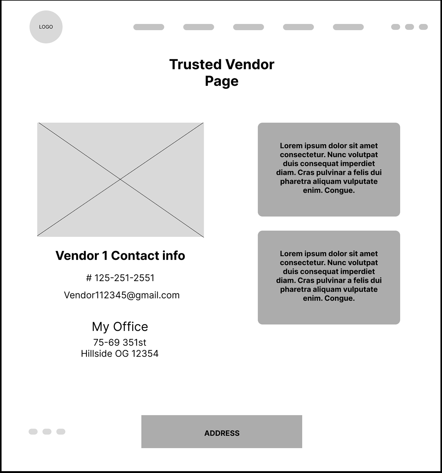
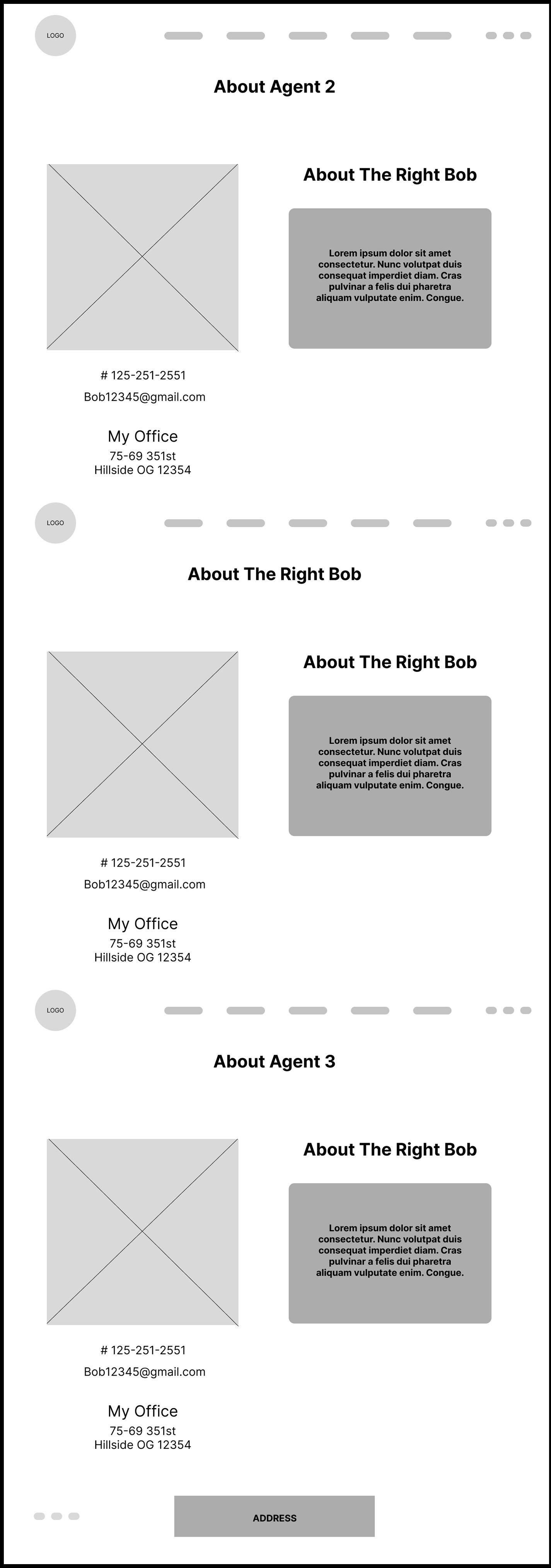
Wireframe
With the site map as a guide, the wireframe was developed to visualize the layout, hierarchy, and user flow before adding visual design elements. It focuses on clear navigation, strategic placement of calls-to-action, and content organization that drives engagement and conversions.
Key Goals:
Translate the site map into a functional page structure
Prioritize calls-to-action in high-visibility areas
Ensure mobile-first responsiveness and accessibility
Maintain a clean, uncluttered layout for easy scanning
Support lead generation through intuitive user flow
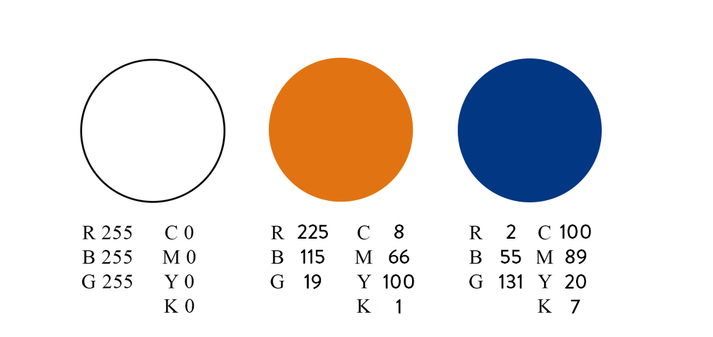
Color Palette
The color palette, drawn from the client’s logo, reflects luxury, trust, and modern sophistication. White represents clarity and minimalism, the warm gold tone conveys prestige and success, and the deep navy blue communicates stability and authority. Together, these colors position the brand as refined, confident, and forward-thinking.

Typography
The typography was chosen to balance elegance and modern readability, aligning with the sophisticated tone of a luxury real estate brand. Times New Roman, a classic serif typeface, brings a sense of tradition, professionalism, and trust—qualities that reflect stability and refinement. Almaria, used for body text, offers a clean and contemporary contrast that enhances legibility across digital platforms while maintaining a polished look. Together, these typefaces create a harmonious blend of heritage and modernity, reinforcing the brand’s premium identity.
Key Screens
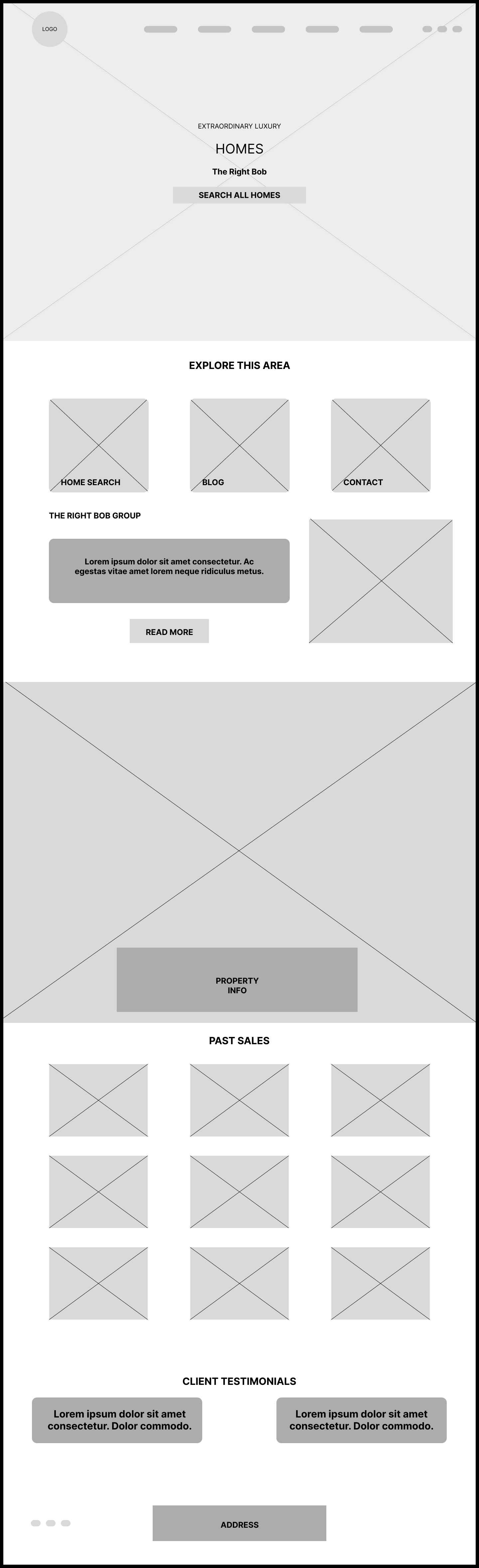
High Fidelity-Iteration
This stage introduces brand colors, typography, and real imagery to the structural framework established in the wireframes. While not final, it serves as a visual prototype to explore layout, hierarchy, and user interaction in a more realistic context. Feedback from this stage will guide refinements before the final version is produced.
Key Focus Areas:
Apply preliminary brand colors, imagery, and type styles for visual context
Test navigation flow and placement of interactive elements
Evaluate visual hierarchy and content balance across pages
Explore layout variations to improve clarity and engagement
Gather feedback for design, content, and user experience improvements
Identify adjustments needed before moving into the final polished stage
Key Screens

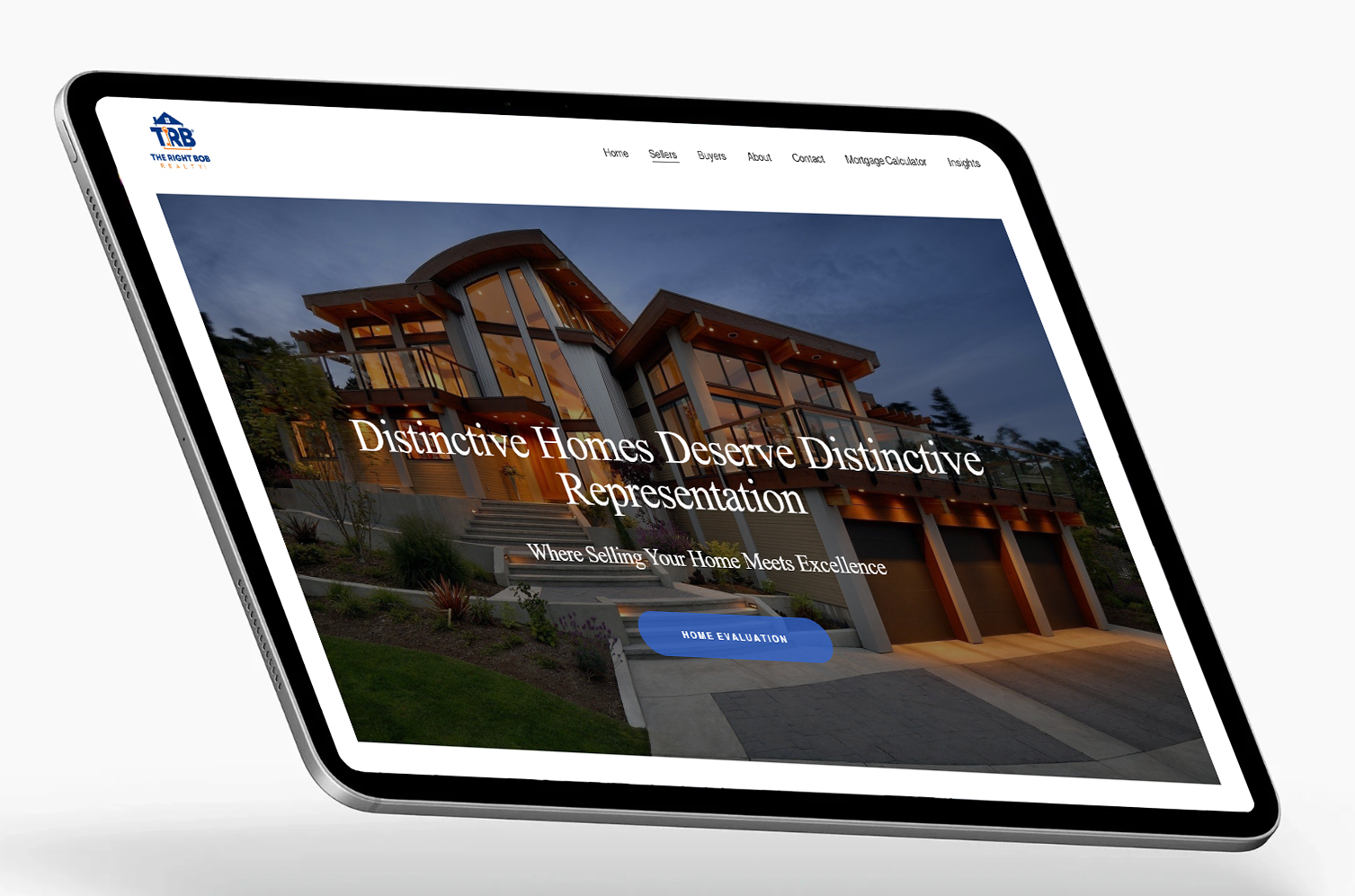
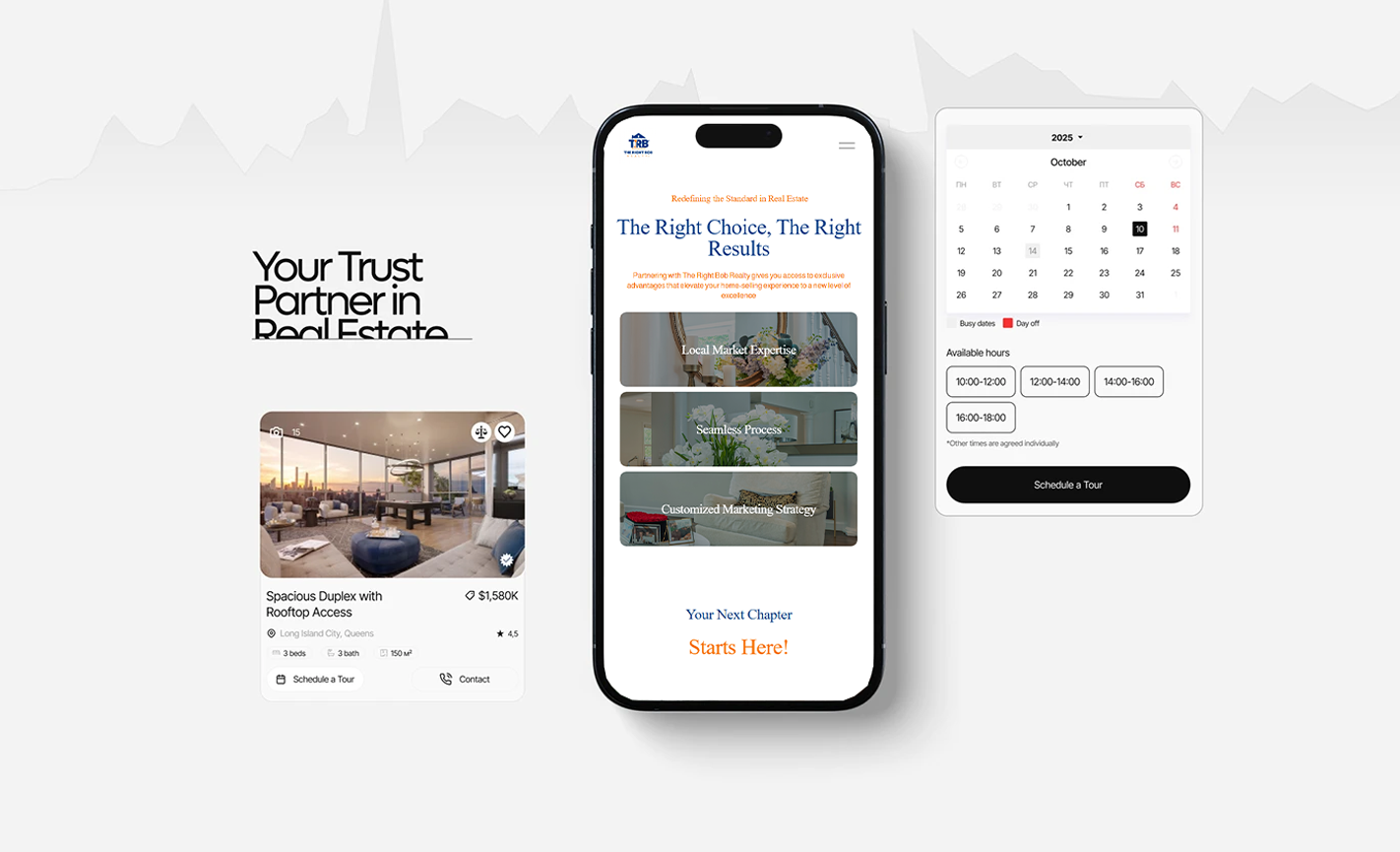
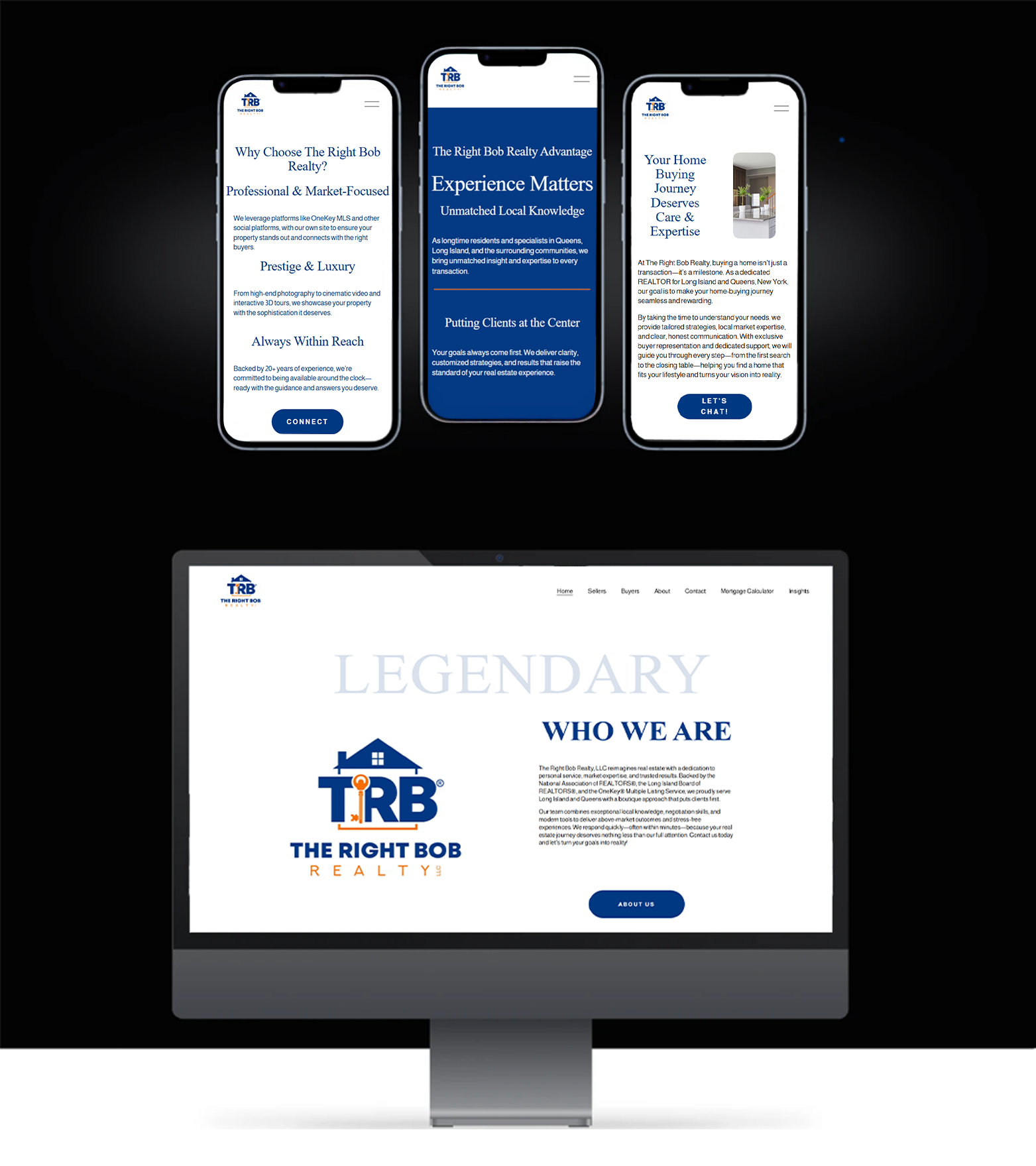
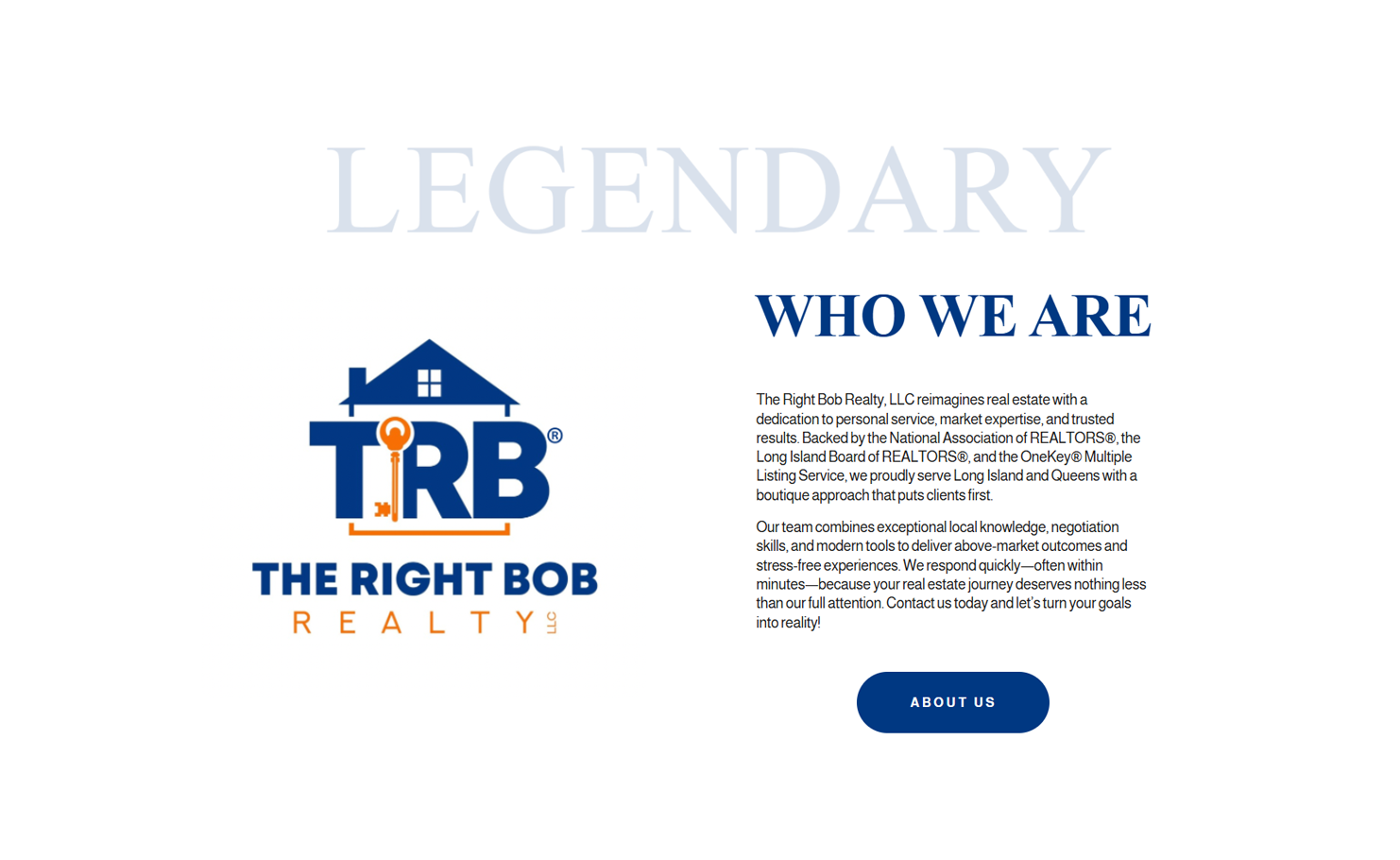
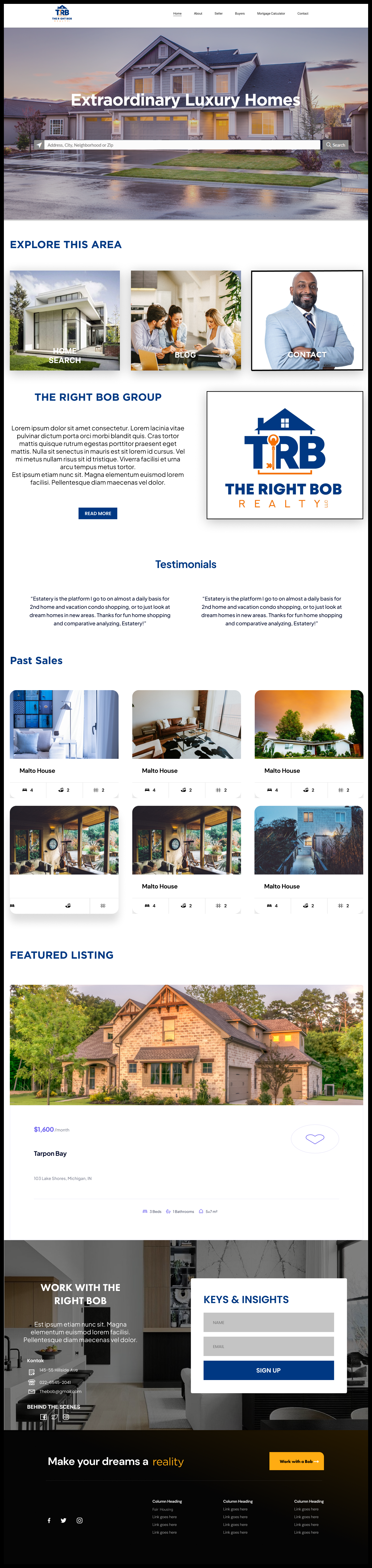
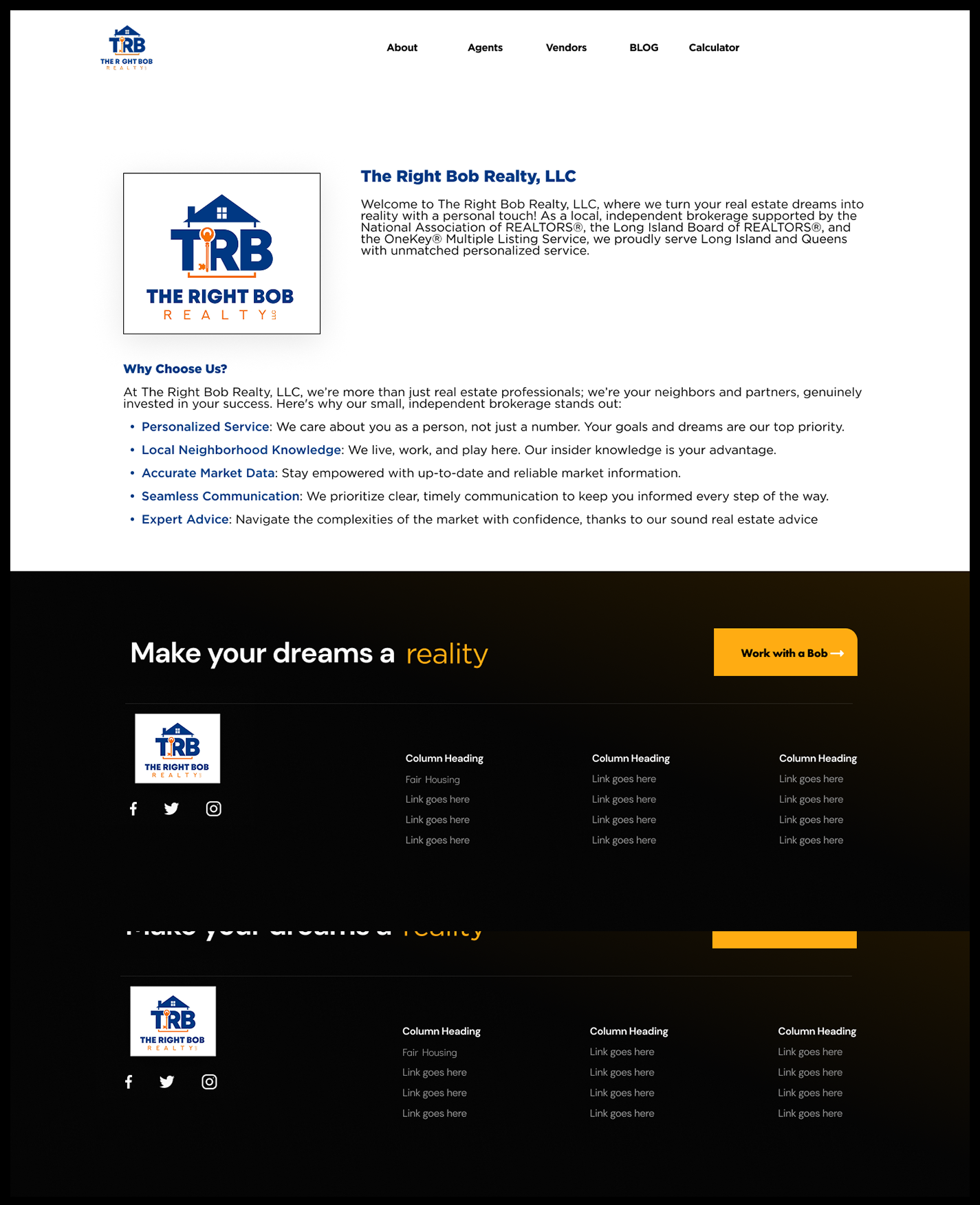
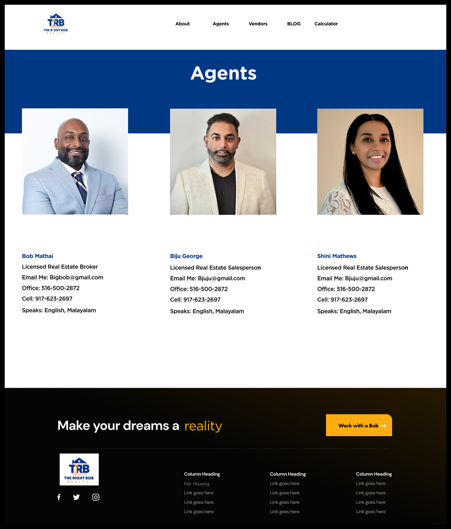
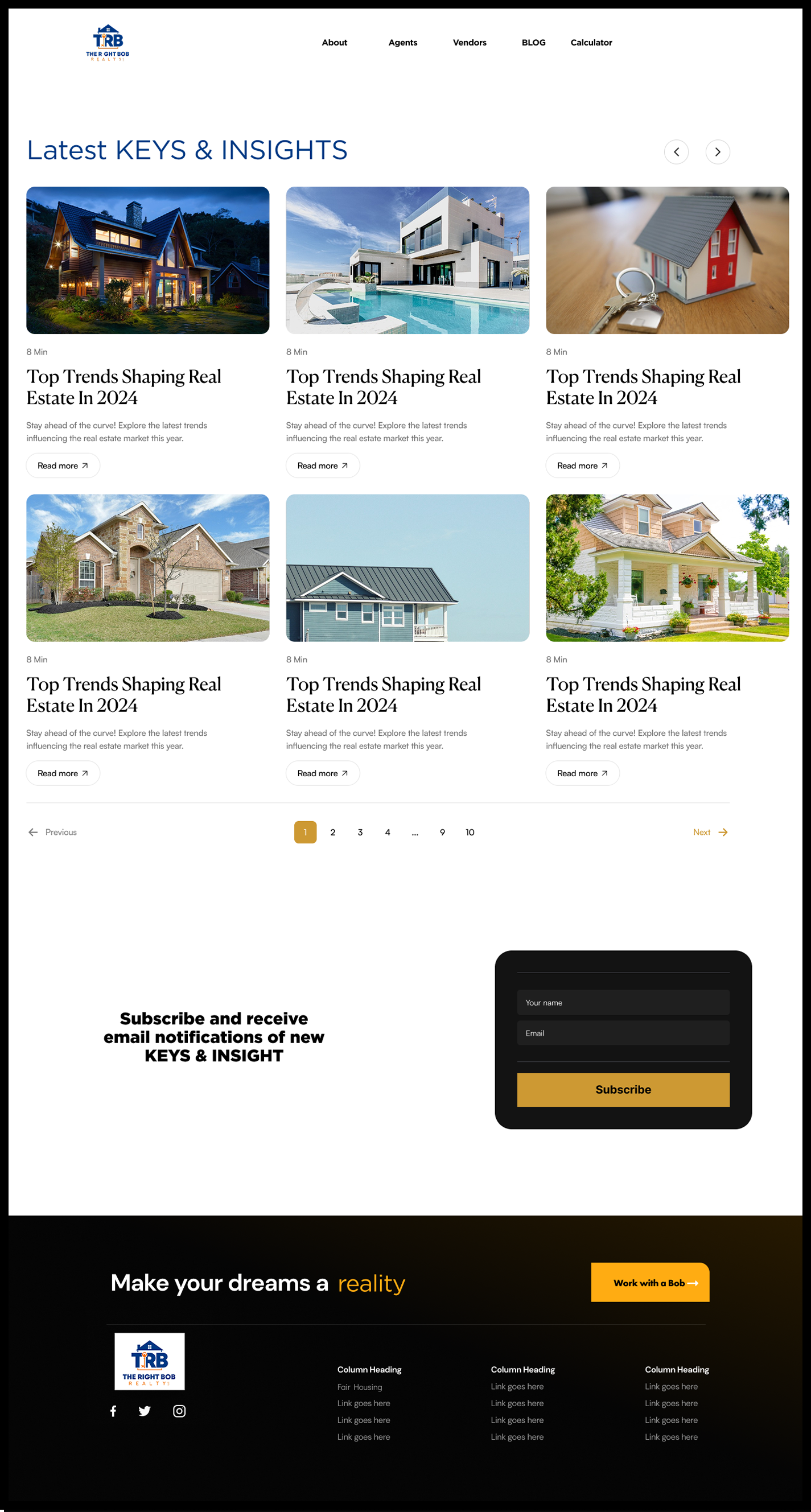
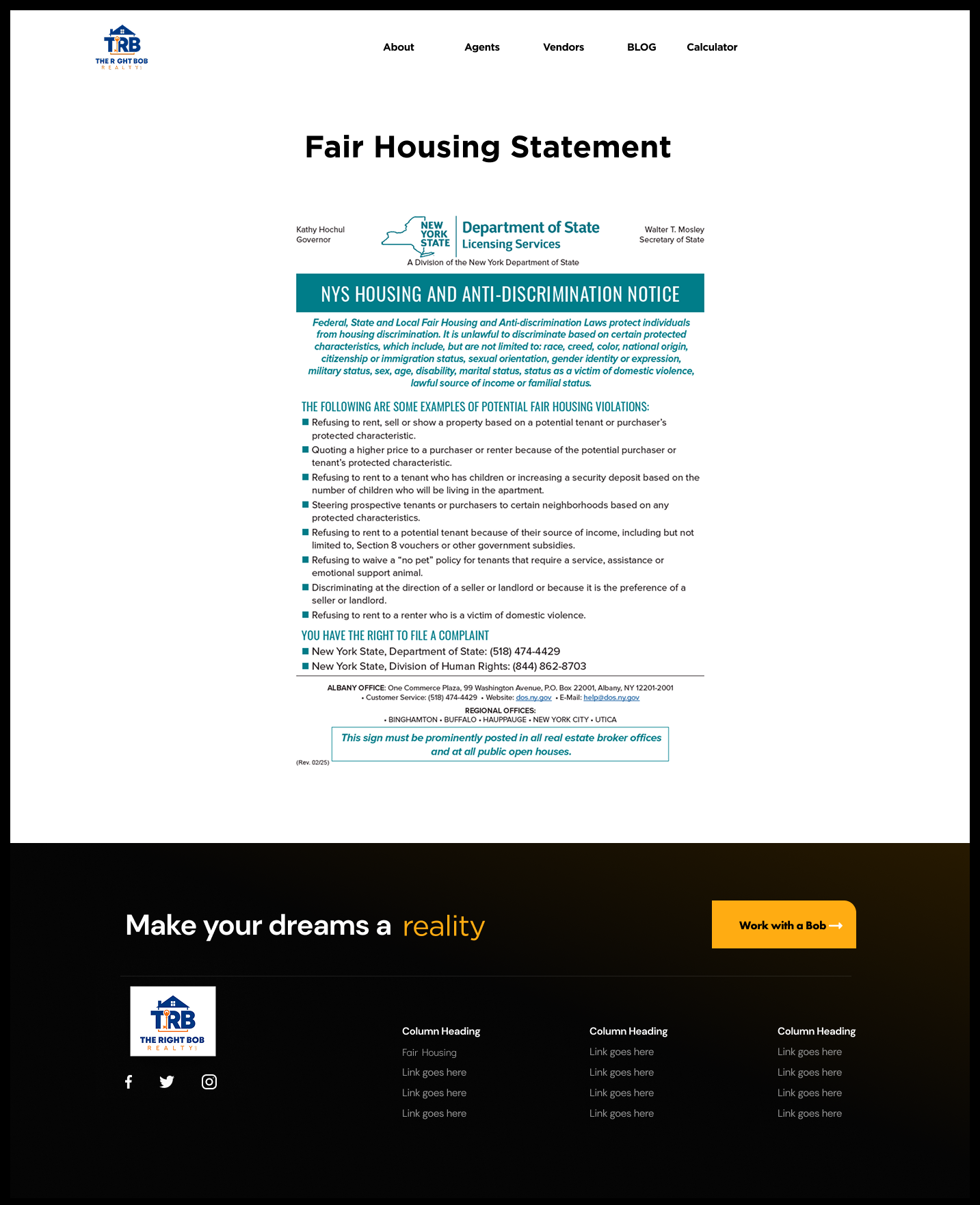
Final Design
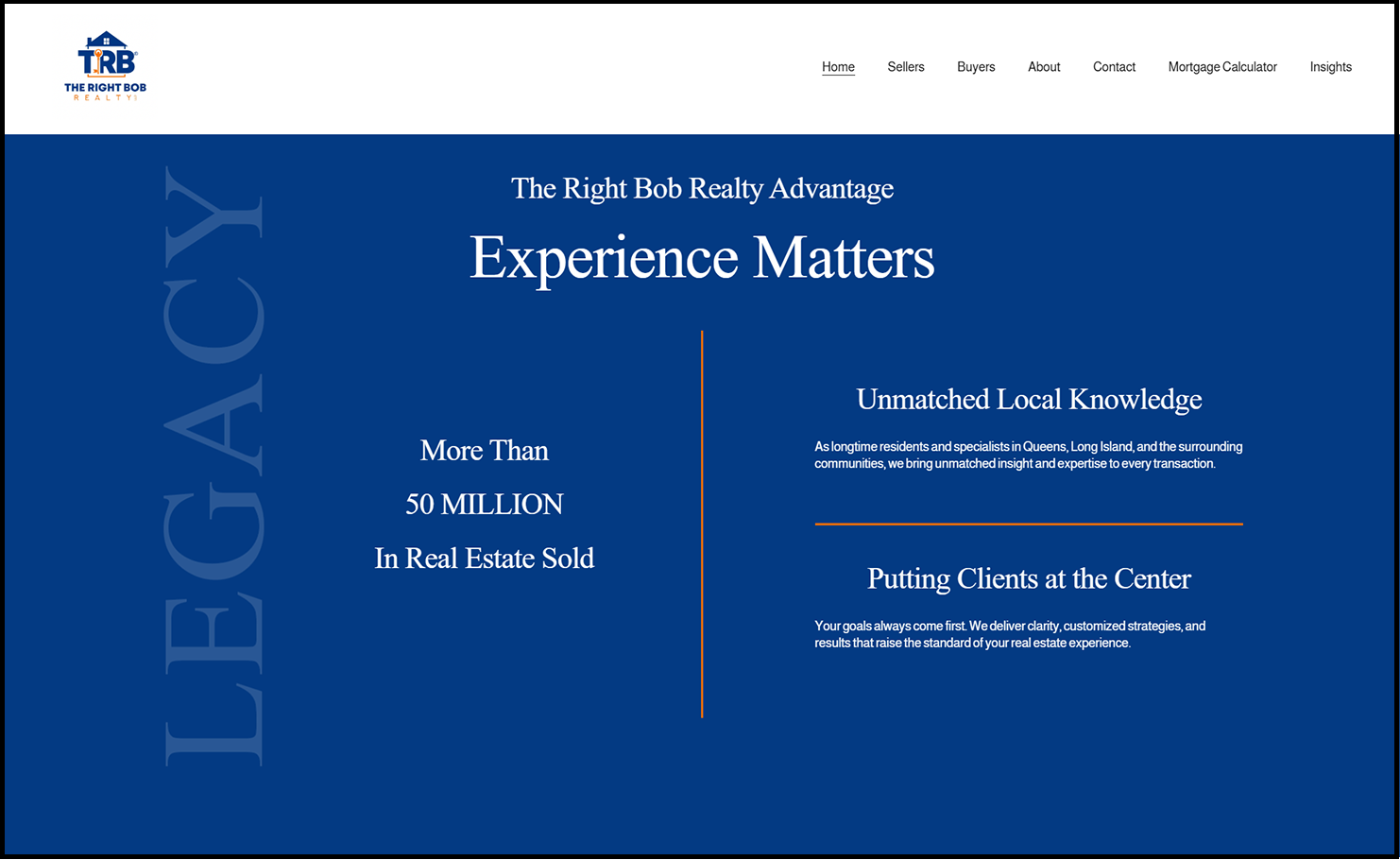
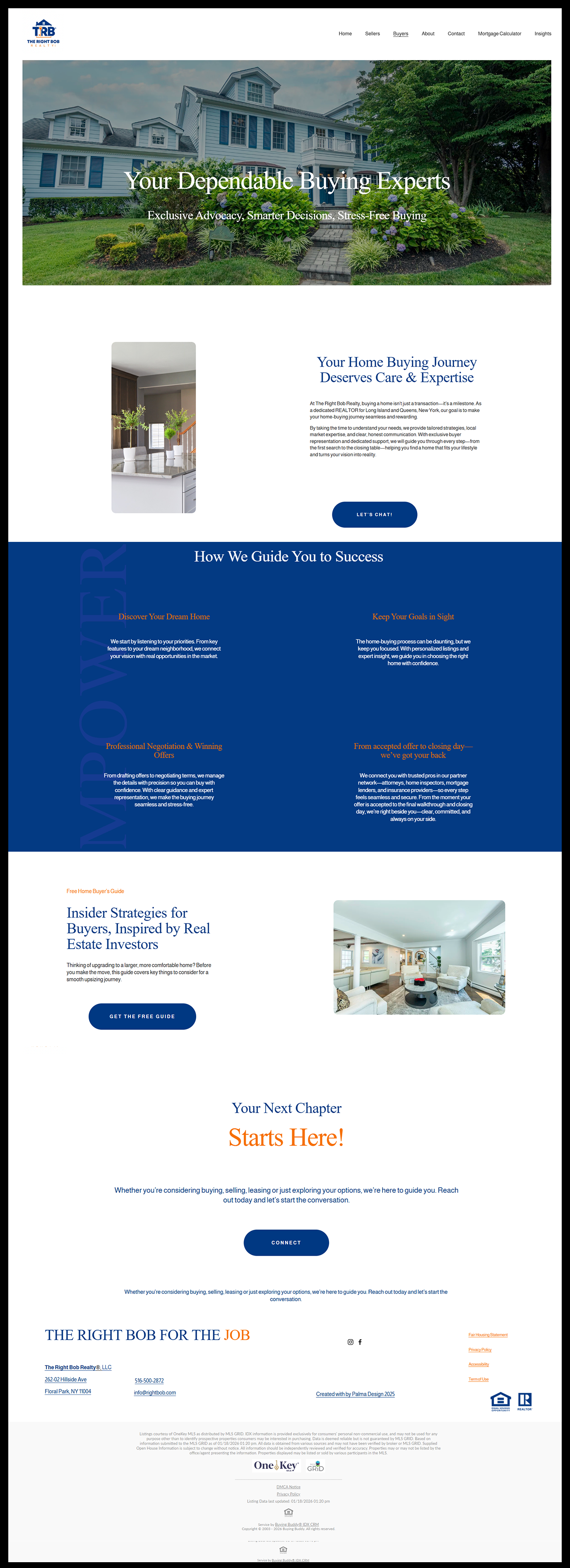
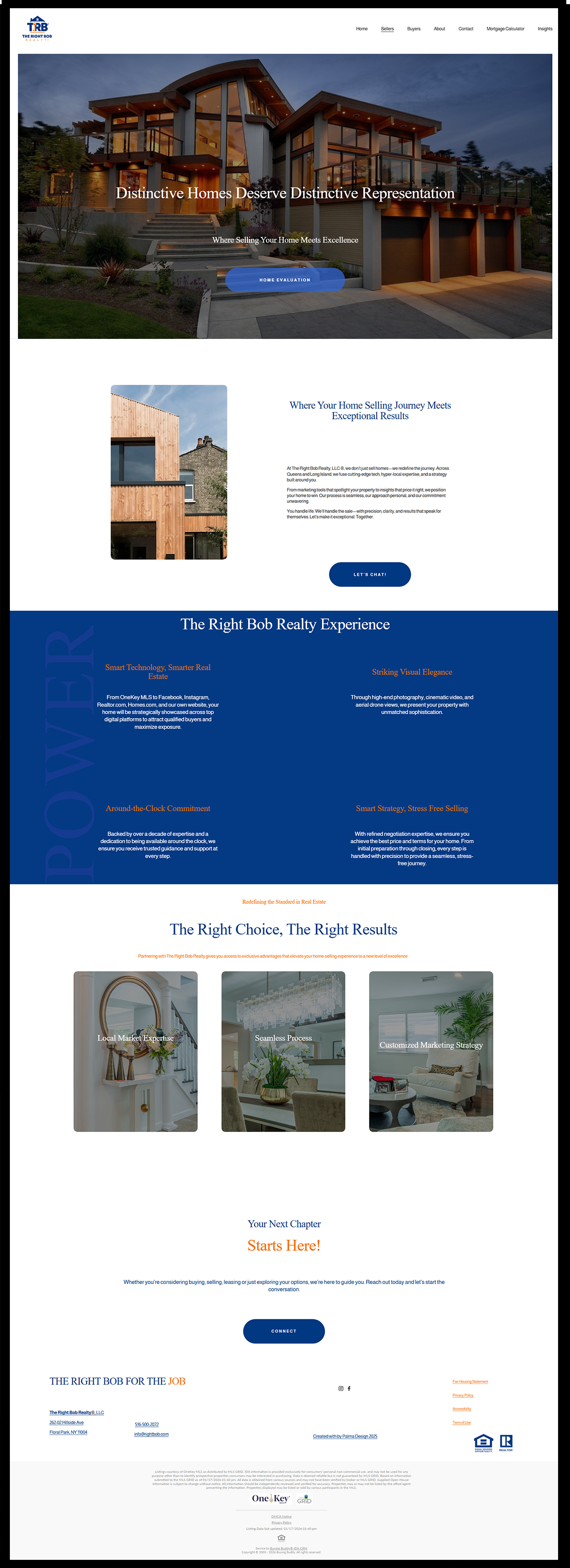
The final design unifies brand identity, user experience, and strategic structure into a cohesive, high-fidelity website. Each page was refined using real content, consistent visual language, and intentional hierarchy to ensure clarity, trust, and ease of navigation. The result is a polished, professional platform designed to guide users naturally toward conversion while reinforcing credibility.
This stage resolves earlier exploratory iterations and focuses on creating a seamless, user-centered experience that supports both business goals and audience needs.
Key Highlights:
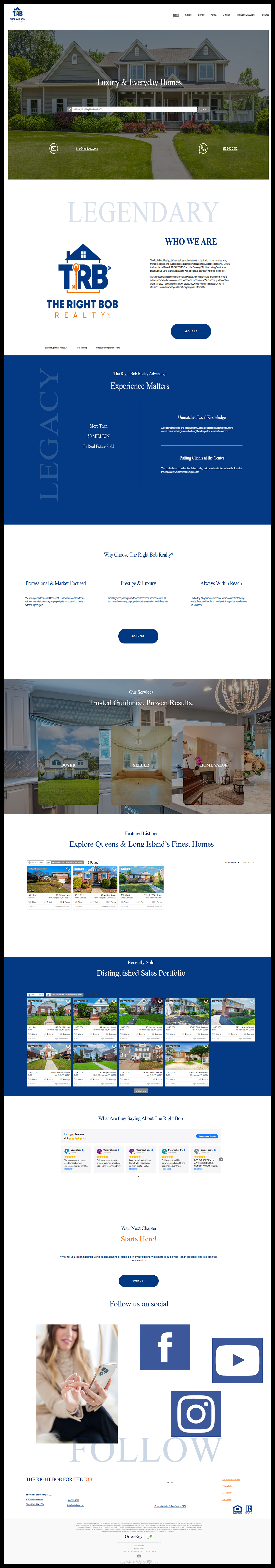
Home Page – A welcoming hero experience supported by search functionality, service overviews, and recent sales to establish trust and encourage exploration.
About Page – Professional photography and narrative storytelling to communicate Susan Chen’s expertise, values, and credibility.
Seller Page – Clearly organized, benefit-driven sections covering marketing, transaction management, and post-sale support, paired with strong calls to action.
Buyer Page – Buyer-focused messaging, strategic guidance, and a streamlined “Find Your Dream Home” form to simplify lead generation.
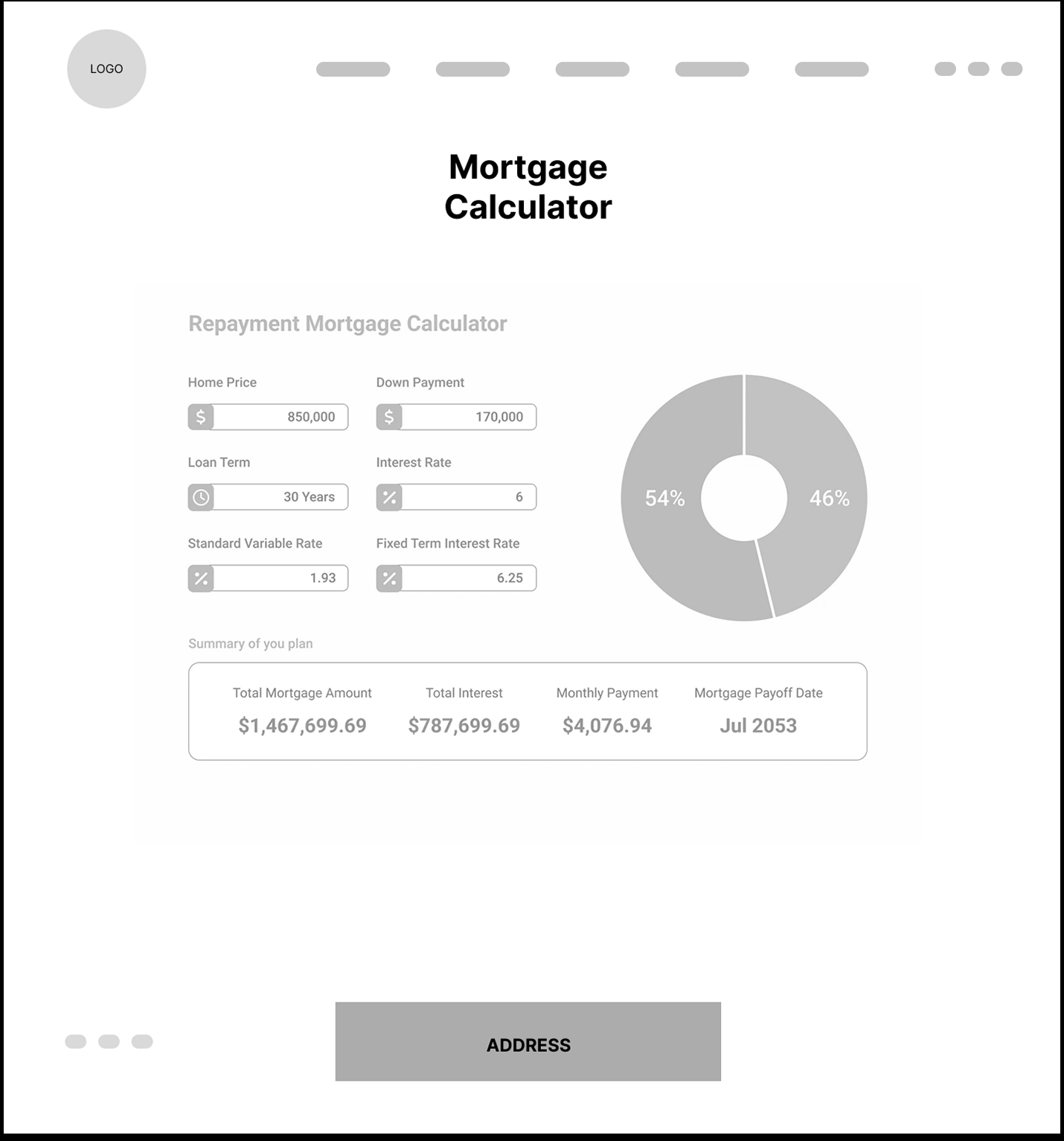
Mortgage Calculator – An interactive tool designed to provide value, increase engagement, and support informed decision-making.
Contact Page – A clean, direct form paired with location mapping to make outreach intuitive and accessible.