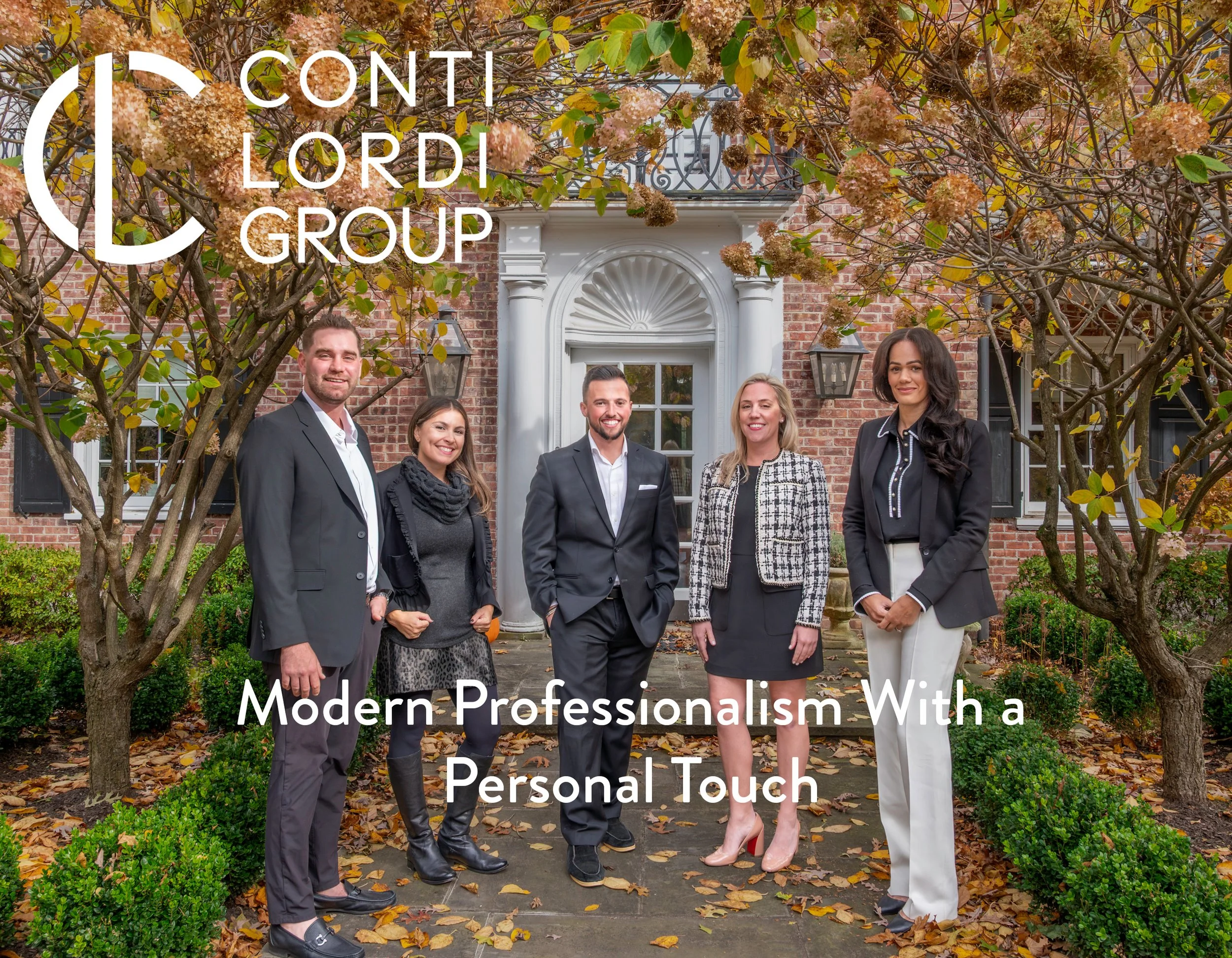
Conti
Lordi.
A brand identity built from the ground up for a newly formed luxury real estate group — designed to communicate professionalism, confidence, and forward-thinking vision without relying on a single real estate cliché.
The mark establishes clarity and sophistication from day one, setting the tone for a cohesive, elevated brand experience that aligns seamlessly with the trusted standards of Compass.

Who is Conti Lordi?
A modern real estate firm dedicated to redefining the buying and selling experience — built on precision, integrity, and contemporary design, providing clients with clear guidance, strategic insight, and a premium level of service.
Operating under the Compass umbrella, their identity reflects both a fresh, forward-thinking approach and the trusted foundation of a leading industry brand. At Conti Lordi Group, they don't just represent properties — they elevate the way people experience real estate.
The principles behind the brand.
Six commitments that define how Conti Lordi Group shows up for every client, at every stage.
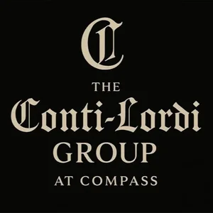
A brief with clear boundaries.
The client's original inspiration didn't align with Compass brand standards or the level of sophistication they wanted to achieve. They requested a mark that avoided every real estate cliché — no rooftops, no windows, no generic iconography — yet their initial direction lacked the modernity and refinement a luxury-facing identity demands.
The goal became creating a clean, contemporary monogram that honored their vision while elevating it — ensuring full alignment with the Compass aesthetic without sacrificing originality or presence.
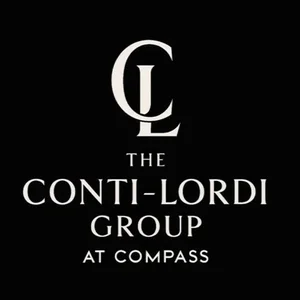

Where heritage meets identity.
The Design Rationale
The Conti Lordi mark is more than an initial — it's a distilled expression of identity, heritage, and partnership. Crafted from the shared initials of the two group leaders, the C and L interlock to form a unified symbol that reflects collaboration, trust, and a shared vision within the Compass ecosystem.
Drawing directly from the Compass typeface, the mark honors the parent brand's refined modernism while carving out a distinct presence for the group itself. Its circular frame creates a sense of completion and continuity — reinforcing the idea of guidance, protection, and full-service support for every client journey. Minimal, architectural, and confidently balanced.
Two letters. Two legacies. One unified mark.
The curved stroke of the C takes center stage, highlighting one of the surnames that forms the foundation of the group. Its open, embracing shape reflects approachability, support, and the relational side of the Conti legacy. Crafted directly from Compass Sans, it strengthens the group's visual connection to Compass while giving the mark its distinct personality.
The vertical strength of the L becomes the defining feature, representing the second surname and the leadership it brings. Upright, clean, and confident, the stroke communicates stability, direction, and the disciplined professionalism of the Lordi name. Its structure, drawn from Compass Sans, keeps the identity modern, refined, and fully aligned with the Compass brand system.
A system built for restraint.
The Conti Lordi palette is intentionally minimal — chosen to communicate trust, sophistication, and modern professionalism without visual noise. Every colour earns its place.
Black anchors the identity with authority and enduring elegance. White creates breathing room and clarity. Gold enters sparingly as the accent — a signal of premium positioning that never overpowers the whole.
Together the three colours align seamlessly with the Compass brand system while carving out a distinct, elevated presence for the group.

Power in consistency.
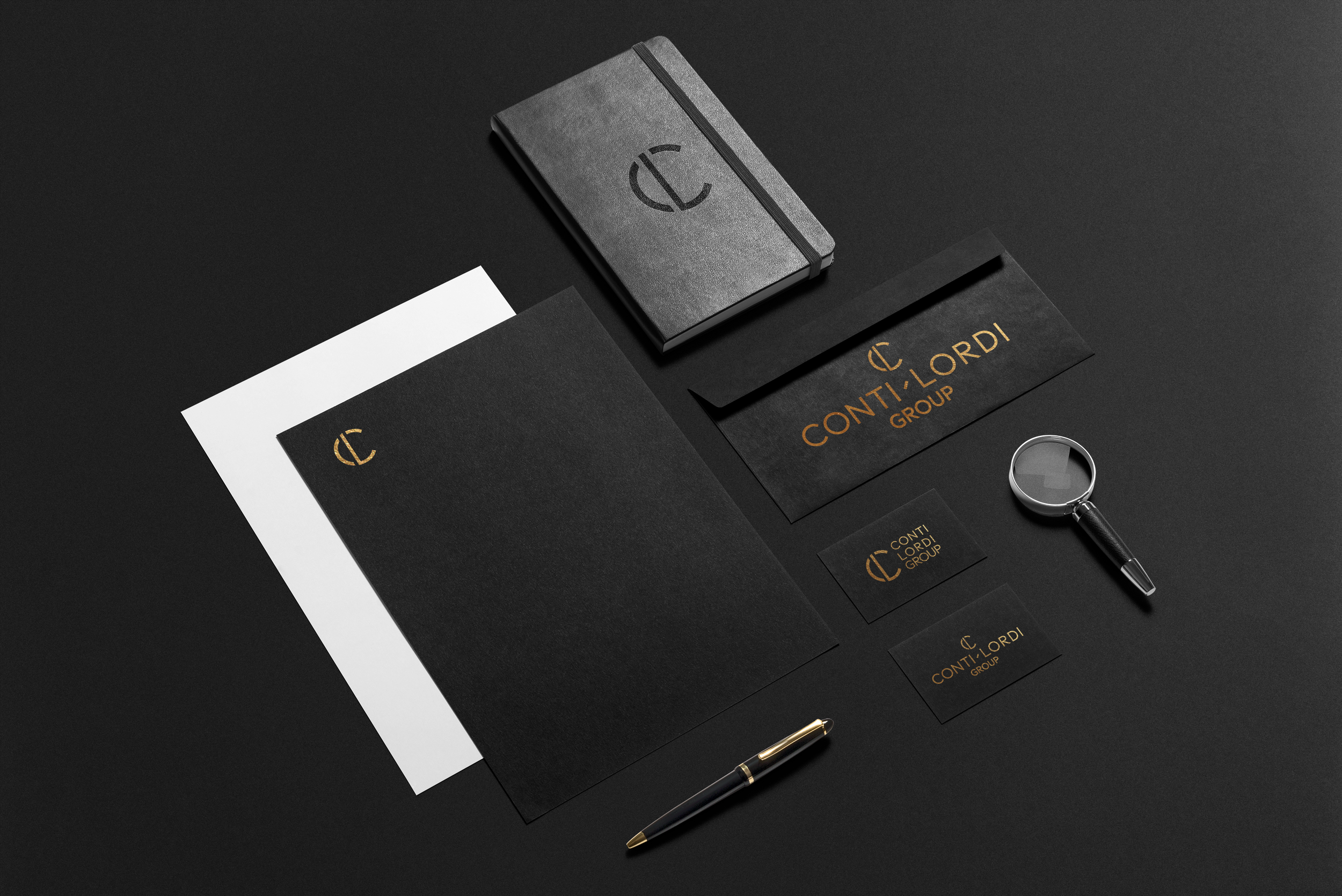
Built for Brand Alignment
The Conti Lordi logotype is crafted in Compass Sans, creating an immediate visual link to the Compass Realty brand. This alignment reinforces trust, sophistication, and a seamless connection to the larger Compass identity.
A simple rectangular separator sits between the two surnames, inspired by Compass's clean geometric style. This subtle detail adds balance and structure while giving the logotype its own signature character.
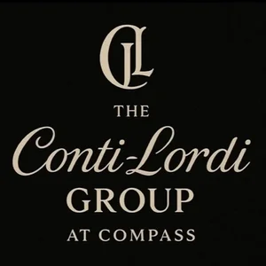
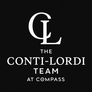
A mark for every context.
Logo Lockups
Built for clarity and professionalism, the horizontal lockup is designed for spaces where width is essential — from website headers and property brochures to listing presentations.
Compact and authoritative, the stacked lockup is ideal for vertical or constrained spaces. Perfect for yard signs, email signatures, and narrow print formats without sacrificing impact.
The mark serves as the brand's shorthand — simple, distinctive, and instantly recognizable. Whether on signage, collateral, or as a social icon, it carries the full identity with minimal space.