SEVEN SQUARED TEAM
Commision Work
This project involved a logo redesign for Seven Squared Team, a modern real estate group specializing in upscale residential properties. The goal was to create a confident, geometric visual identity that would stand out in a competitive market while remaining professional and approachable.
Visual identity // Logo redesign // Real estate branding
SERVICES 2025
Logo Redesign
Visual Hierarchy System
Typeface Customization
Real Estate Brand Identity
Digital & Print Asset Mockups

New Responsive Logo Identity
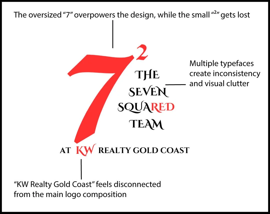
OLD LOGO

Experimenting with line quality, form exploration, and stylistic contrast. Each sketch represents a different interpretation—ranging from bold and structured to organic and fluid—demonstrating the numeral's potential as a symbolic identity mark.
Sketch

Logo Iteration Concepts
These four logo explorations for Seven Squared Team focus on form variation, type pairing, and visual hierarchy. Each concept tests symbol design, modern branding, and legibility, helping define the brand’s identity system and overall design direction.

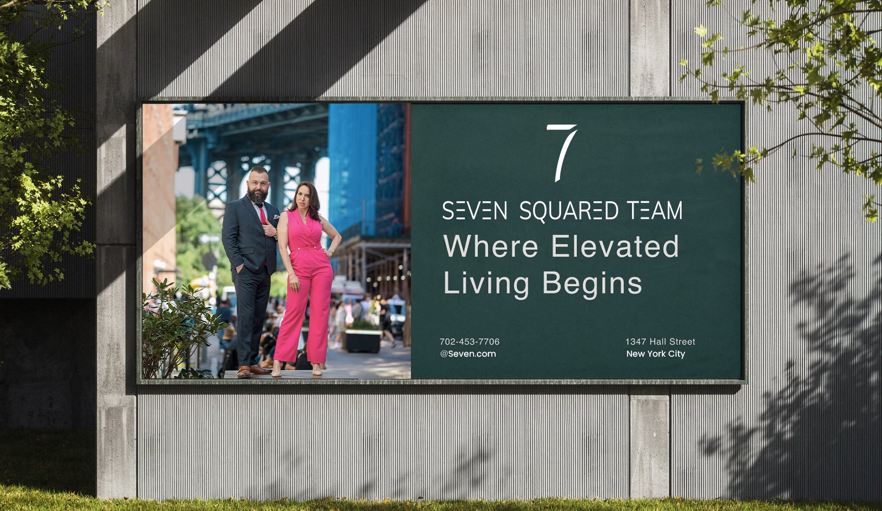
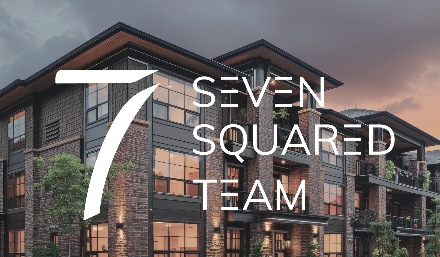
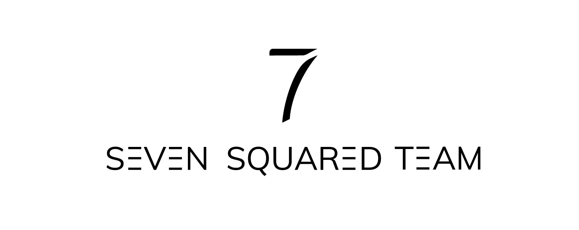
I developed a bold, custom “7” mark that functions as a visual anchor across digital and print collateral. The wordmark uses a stylized monospaced type with intentional line breaks, giving it a distinct, architectural rhythm that reflects the team's structured, design-forward approach to property and client services. This rebranding unified their identity across signage, web, and social media platforms.
Final Logo


The purpose of this approach is to create visual harmony, making the logo adaptable for multiple uses, whether on business cards, website headers, merchandise, or social media profiles. By setting clear guidelines for the logo lockup, I can ensure that my brand remains consistent, memorable, and easily recognizable, regardless of the context in which it appears.