ROSE VALLEY CAKES
SERVICES 2025
Logo Redesign
Color Palette & Typography System
Typeface Customization
Visual Identity Modernization
Brand Messaging Strategy
To rebrand and strengthen the company's identity by refining its logo, color palette, and typography to better align with its core values. This project also focused on enhancing brand messaging to establish a modern and relatable tone, creating a more effective connection with the target audience.
Commision Work
Visual Identity // Logo Redesign // Brand Messaging
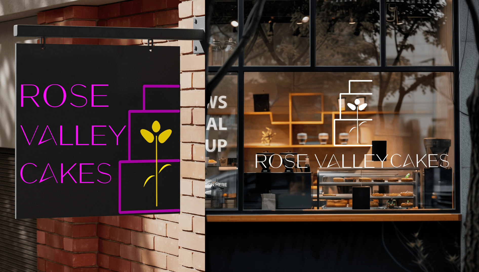
OLD LOGO

New Responsive Logo Identity

Mission statement
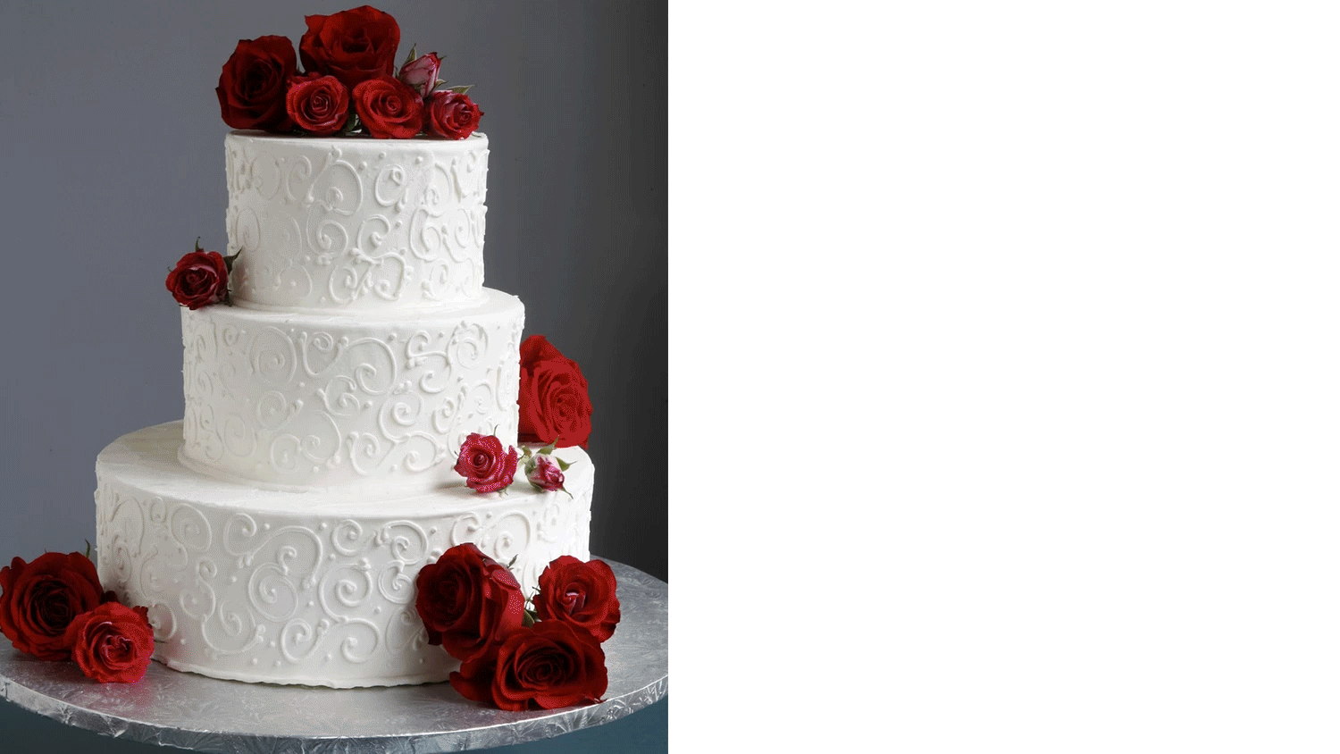
We strive to honor our loyal customers with every bite, building connections through word-of-mouth and heartfelt service, while continuing to be the rising star of vegan baking in New York City.
Our mission is to bring people together through the joy of wholesome, handcrafted, vegan baking. Rooted in family tradition and fueled by a passion for creativity, we are dedicated to serving our Queens and New York City community with cakes that are as thoughtful as they are delicious.
Brand Values
Innovation
We believe in transforming the ordinary into the extraordinary. By embracing creativity and experimentation, we push the boundaries of design, ensuring each piece reflects fresh ideas and artistic imagination.
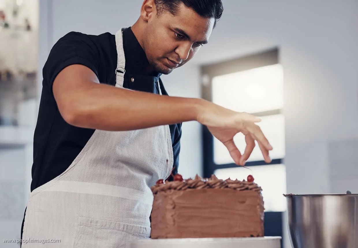
Craftsmanship
Every creation is made with care, precision, and passion. Our artisans honor the tradition of handmade work, blending skill and artistry to deliver pieces that feel personal and timeless.
Sustainability
Cork is at the heart of what we do—a renewable, eco-friendly material that allows us to design responsibly. We are committed to protecting the planet while crafting beautiful, enduring works.
Authenticity
Each piece is a true reflection of individuality and nature’s charm. We stay genuine in our process, creating meaningful designs that connect deeply with the people who experience them.

BRAND TONE / THEMES
Logo Development
Sketches
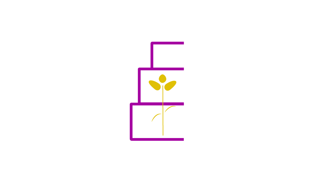
The logo for Rose Valley Cakes combines a minimalist tiered cake outline with a blooming floral symbol to reflect elegance, nature, and craftsmanship. The sketches show an exploration of cake shapes and floral motifs, merging them into a cohesive visual identity. The final design communicates a boutique, artisanal feel that aligns with the brand’s name and product.


Why it works
Elegance & Sophistication – Didot is known for its high contrast between thick and thin strokes, which creates a refined, high-end look. This aligns perfectly with a bakery that wants to feel premium and artistic.
Timeless Appeal – It carries a sense of tradition and craftsmanship, connecting well with your family-owned story.
Luxury Branding Vibe – Many fashion houses and luxury brands use Didot-style fonts (like Vogue), so it instantly elevates the perception of your bakery as more than just casual—it suggests quality and exclusivity.

Palette
The updated color palette introduces bold, contrasting tones—vibrant magenta and rich ochre—that feel both fresh and unconventional. These shades break from tradition, symbolizing the brand’s confidence, creativity, and modern sensibility.
Iterations
These iterations show an exploration of simplifying the floral concept into clean, minimal forms while keeping the “rose” essence tied to the brand name. Starting from more literal illustrations, the designs gradually become more abstract, focusing on line clarity and shape reduction. The progression reflects a shift toward a modern, versatile identity that balances elegance with simplicity, aiming for a mark that works well across both small-scale applications (like packaging stamps or social media) and larger formats (like signage).

Logo Lock
Horizontal Lockup
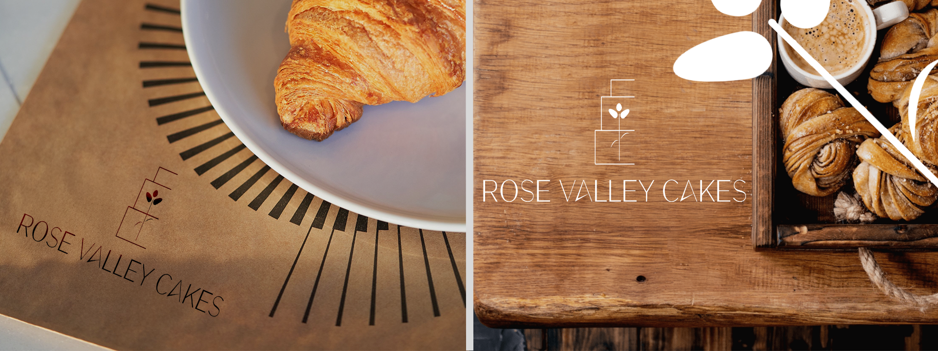
The horizontal lockup offers a balanced and versatile presentation, perfect for website headers, packaging, and promotional materials. Its linear format ensures clarity and readability across both digital and print applications.
Stacked Lockup
The stacked version emphasizes strength and structure, making it ideal for signage, labels, and social media profiles. This arrangement highlights the brand name while maintaining a compact and modern appearance.
Logo Icon
The standalone icon distills the brand into its simplest, most recognizable form. Minimal yet distinctive, it works seamlessly as a favicon, watermark, or subtle branding element across different platforms.

Logo Evolution Statement
Rose Valley Cakes’ previous logo carried a sense of nostalgia and charm, with its delicate floral illustration and soft pastel palette. It captured the boutique, handcrafted essence of the bakery but struggled with scalability and clarity across modern applications.
The new logo reimagines the brand with bold simplicity and versatility. By reducing the cake and floral elements to clean, geometric forms and pairing them with a sharp, contemporary typeface, the design communicates confidence, professionalism, and modernity. This refreshed identity strengthens brand recognition and ensures seamless adaptability across packaging, signage, social media, and digital platforms—reflecting Rose Valley Cakes as both a family tradition and a rising star in vegan baking.

LOGO IN ACTION