Visual Identity // Logo Redesign // Brand Messaging
Logo Redesign & Branding
Project Overview
This rebranding aimed to strengthen the company’s identity by refining its logo, color palette, and typography system to better reflect its core values. The visual refresh was designed to bring clarity, consistency, and a more intentional tone to the brand’s overall look and feel.
SERVICES PROVIDED
Logo Redesign
Color Palette & Typography System
Brand Identity Guidelines
Brand Messaging Development
Mockups for Digital
TOOL USED
Photoshop
Illustration
Premiere Pro
After Effect

OLD LOGO

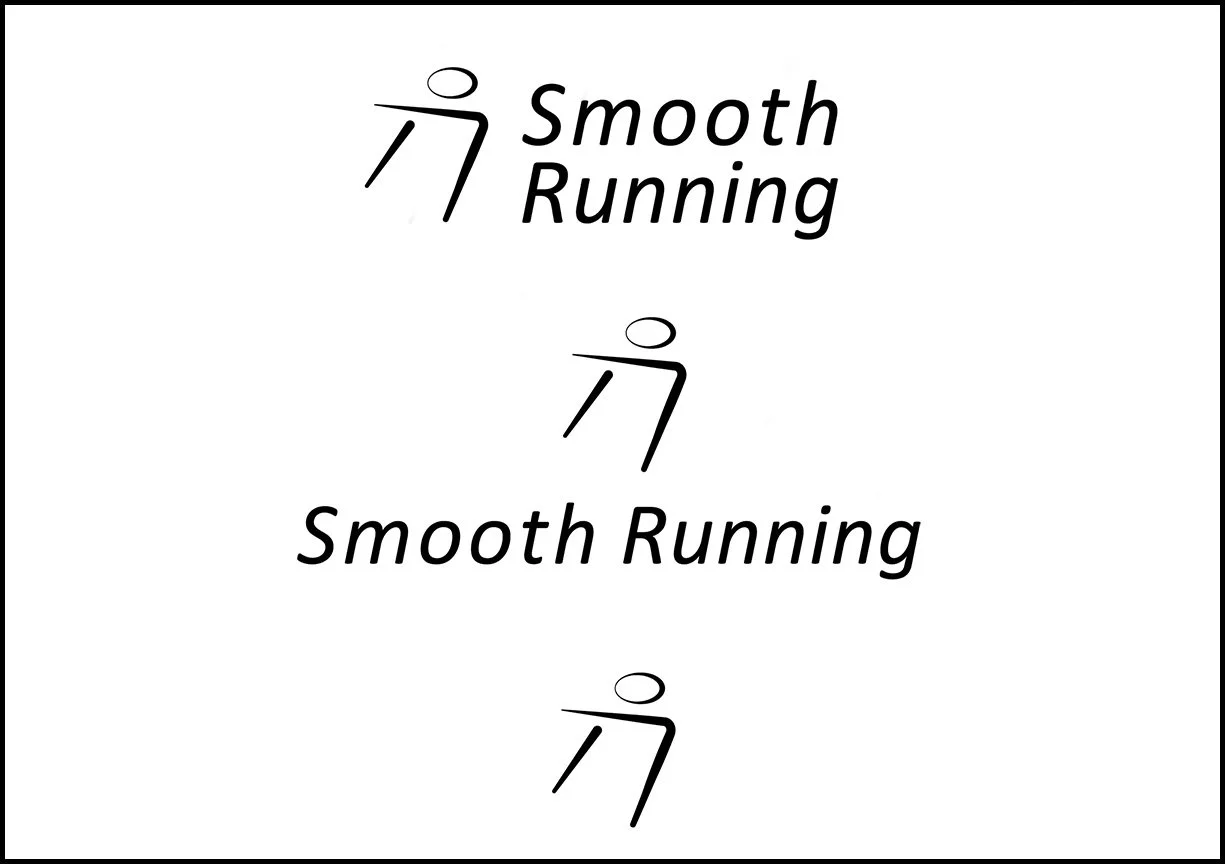
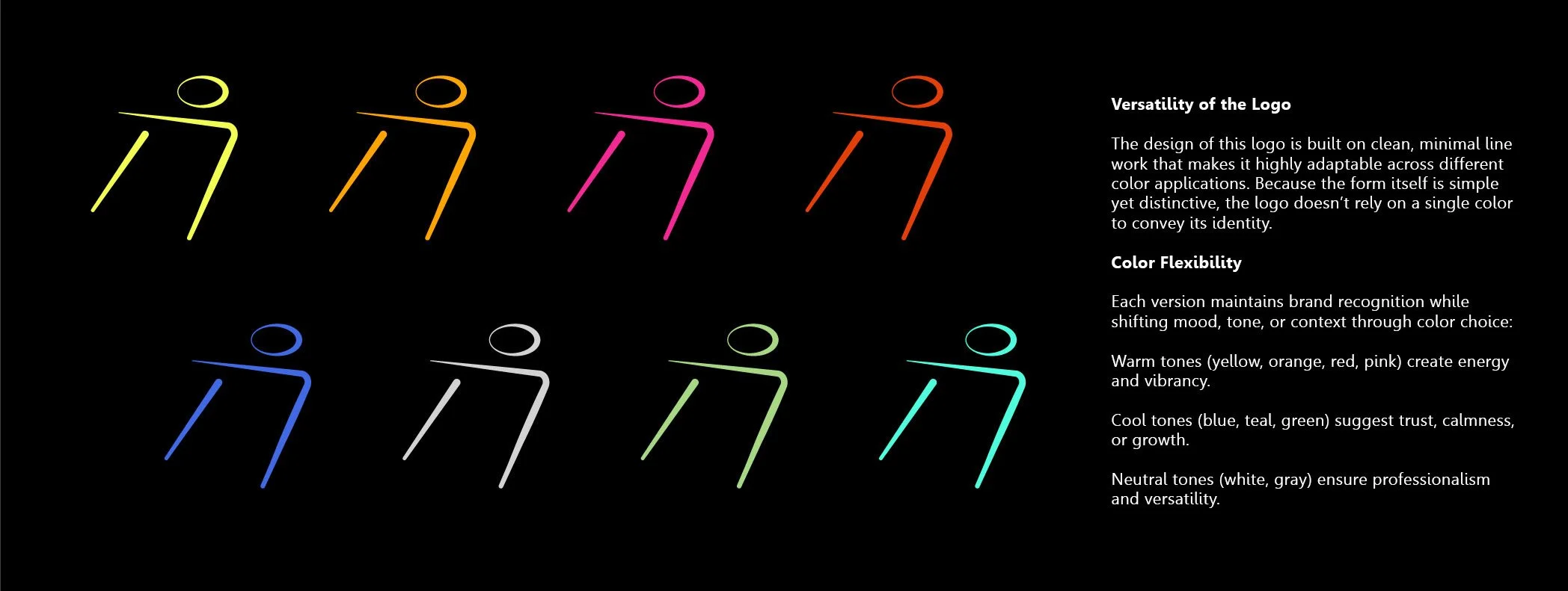
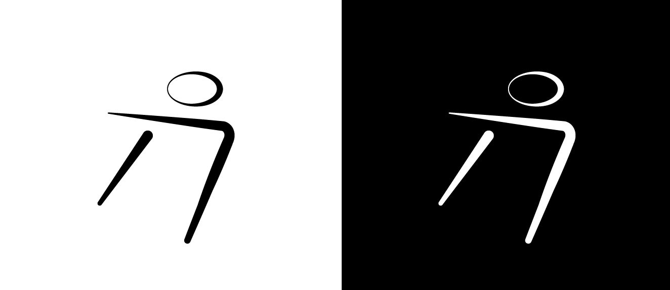
New Responsive Logo Identity

Mission Statement
At Smooth Running, our mission is to create performance-driven, stylish apparel that empowers individuals to move with confidence and comfort. We design clothing that blends innovation, quality, and modern minimalism — giving our community the freedom to look good, feel good, and keep moving forward.
Brand Values
Performance
We design apparel that supports movement, endurance, and comfort at every step.
Simplicity
Clean, modern designs that are versatile and timeless.
Confidence
Clothing that empowers people to look good and feel unstoppable.
Innovation
Constantly improving fabrics, fits, and details for better performance.
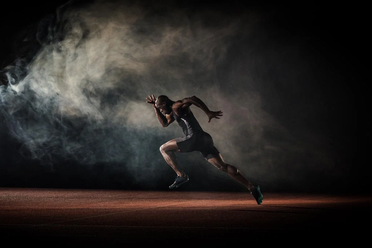
Behind The Logo
This image of a runner captures the energy, focus, and forward motion that I wanted to reflect in the Smooth Running Logo. The Strong lines of the body. lean forward posture and the sense of speed inspired me to reduce the form into a minimal abstract mark. By simplifying the movement into clean lines and a circle, the logo communicates the same idea of smooth, powerful motion- but in a versatile modern wat that works across different application.


This sheet shows early logo exploration sketches for Smooth Running. Each drawing experiments with different ways of capturing motion, speed, and energy through simplified human figures, dynamic lines, and abstract shapes. The variations range from literal runners to symbolic marks, all aiming to express the brand’s core identity: movement made smooth, powerful, and stylish.

This stage represents the early iterations of the Smooth Running logo. The focus was on experimenting with minimal line work, curves, and geometric balance to capture a sense of motion, rhythm, and energy. Each version explores different ways to express running — from simple angled lines suggesting forward drive, to flowing curves that communicate smoothness and momentum. The goal was to refine the form into something clean, modern, and versatile, while keeping the logo adaptable across multiple applications.
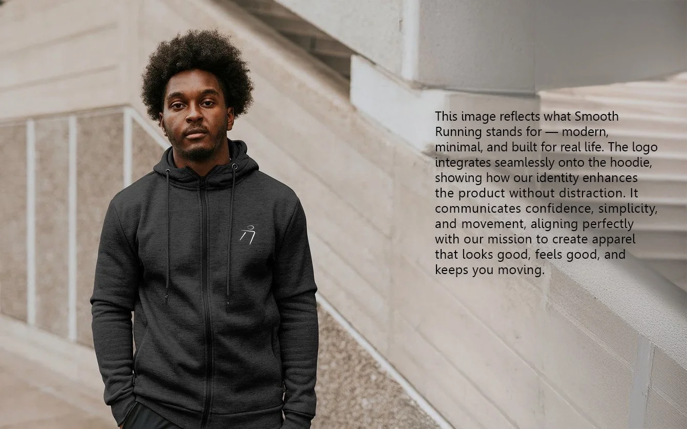
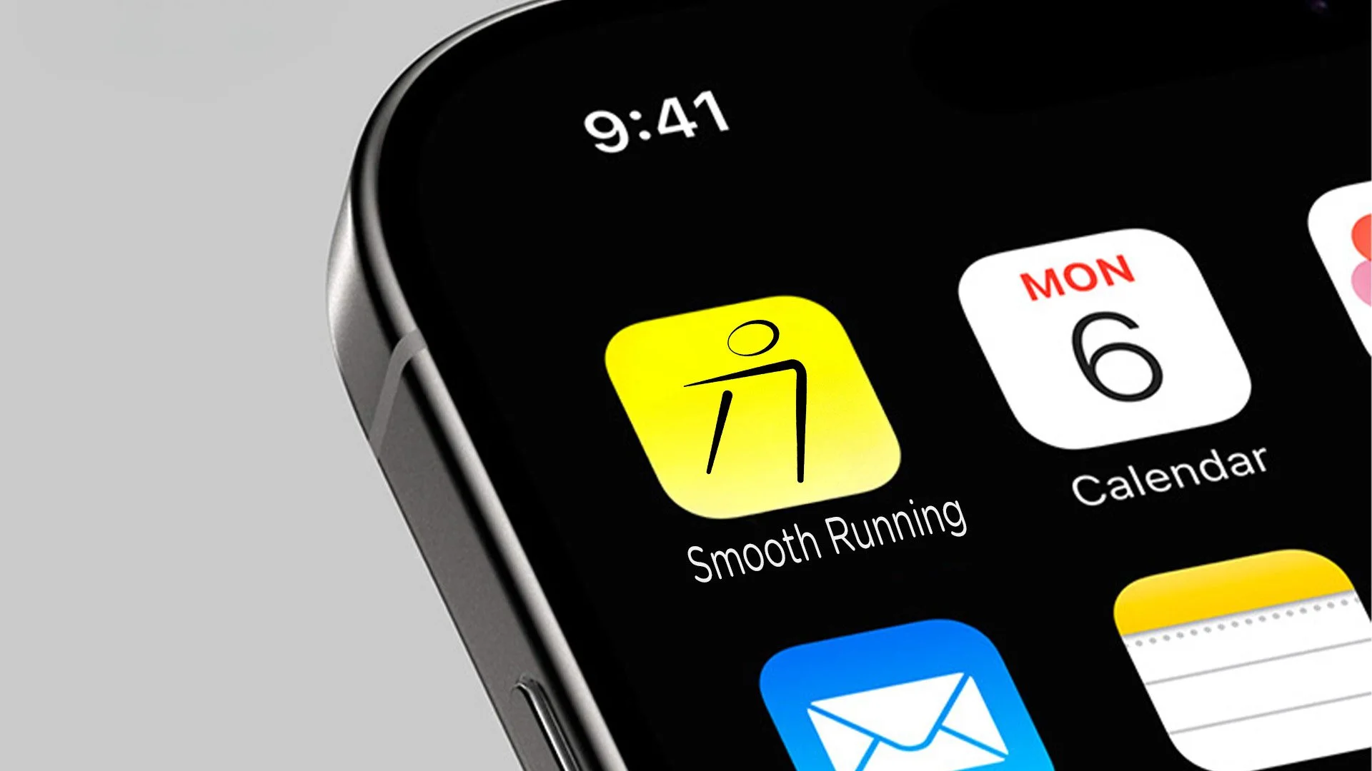
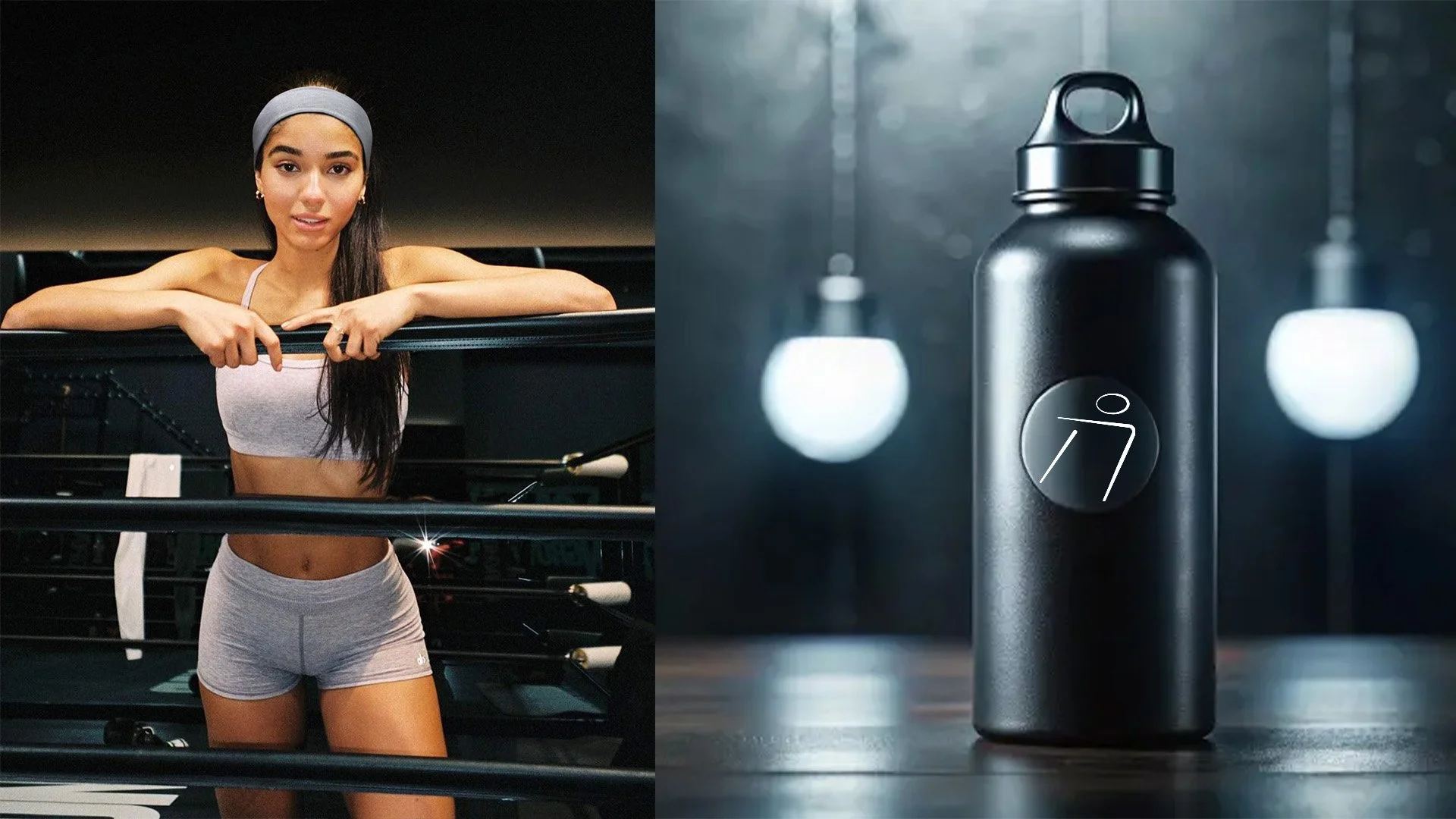
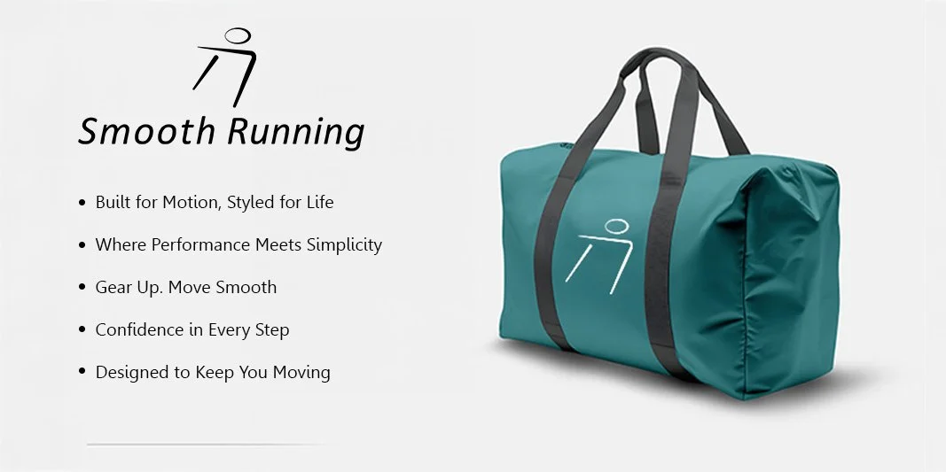
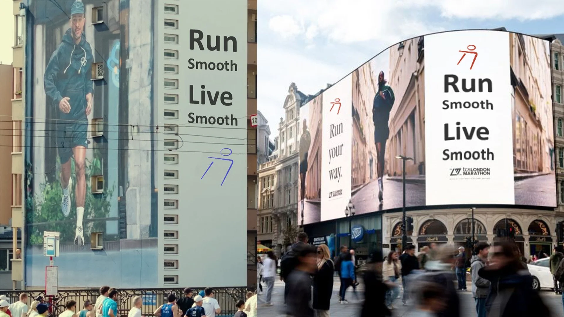
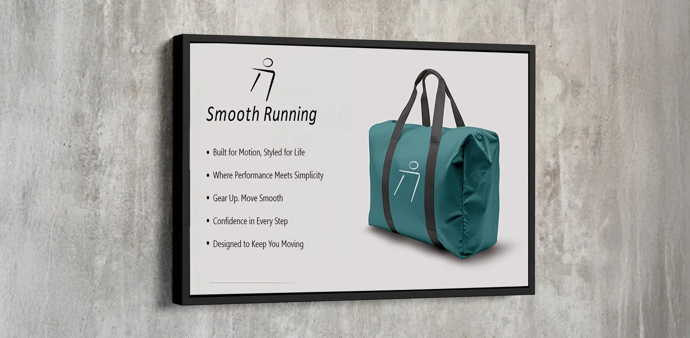
LOGO IN ACTION