

The
Right Bob.
therightbob.com ↗
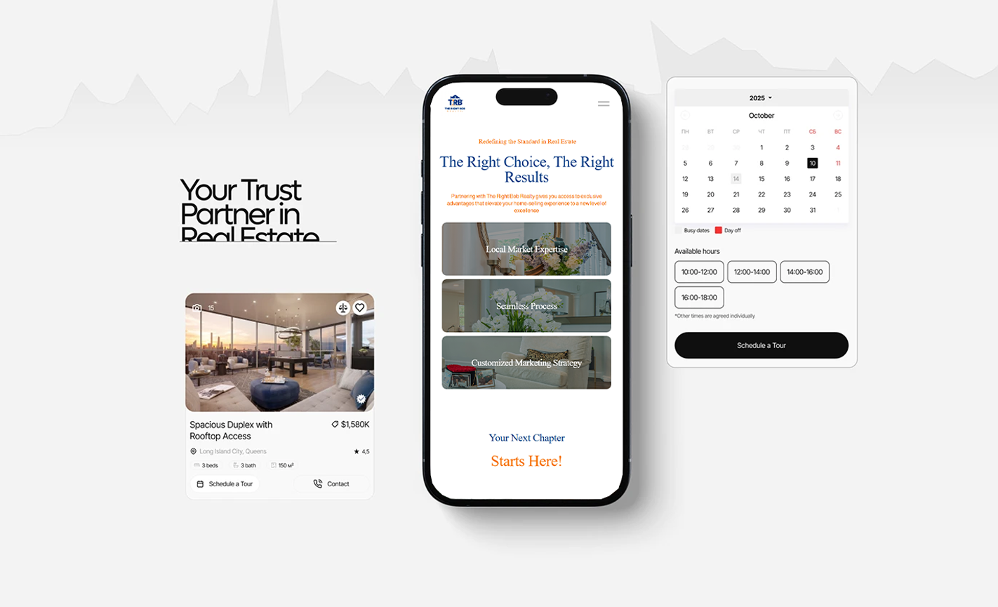
Developed a professional, responsive website for Right Bob — a licensed real estate broker — built to showcase company branding, services, and listings. The design prioritized user experience, mobile compatibility, and a clean visual hierarchy that reflects the brand's identity as a modern, trusted name in real estate.
Beyond the website, the project grew into a full creative campaign. Custom illustrations, print collateral, catalog design, graphic motion, and a video commercial were developed to extend the brand into the physical world — giving Right Bob a consistent, recognizable presence across every client touchpoint.

No identity.
No direction.
The existing site was built on a generic real estate template — heavy blues, disconnected stock photography, and no visual language that belonged to Right Bob specifically. It could have been any brokerage. The challenge was to move the brand away from the template entirely and build something with a real identity: a distinctive look, a consistent tone, and a design system that could carry across the web and into print and video.
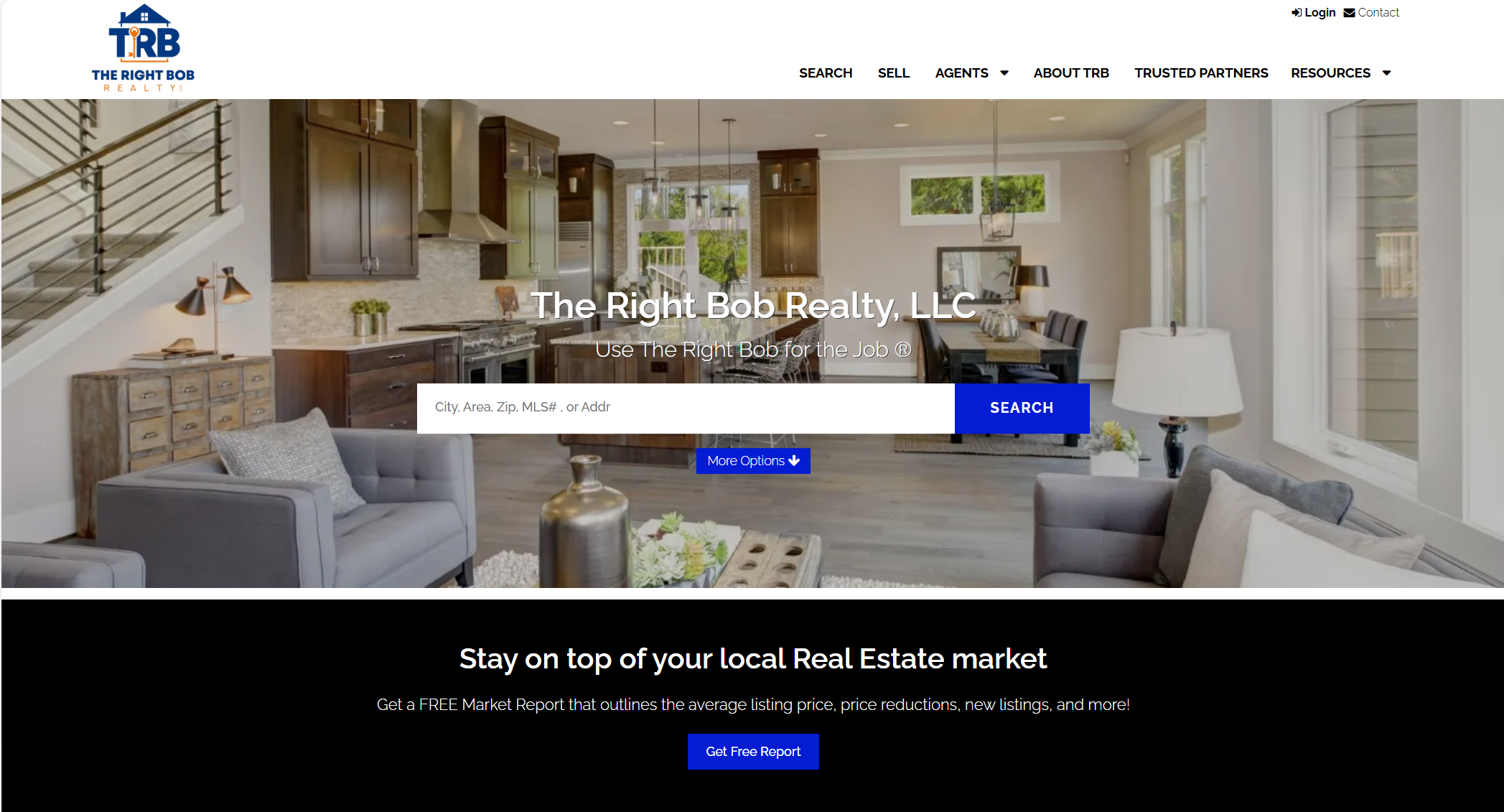 Original site — before redesign
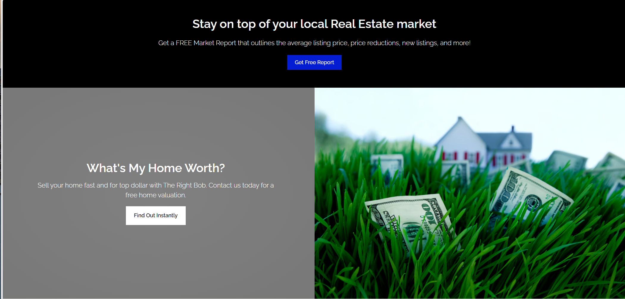 Interior pages — no visual consistency
Mapping the structure.
Before a single screen was designed, the site's architecture was mapped out to establish a clear, logical foundation — organizing navigation and subpages to ensure content is purposeful, easy to find, and optimized for lead generation.
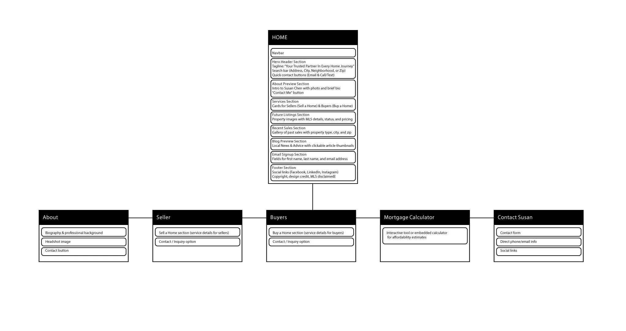 Site map — page hierarchy & user flow
With the site map as a guide, wireframes were developed to visualize the layout, hierarchy, and user flow before adding any visual design. The focus was on clear navigation, strategic placement of calls-to-action, and content organization that drives engagement and conversions.
The color palette, drawn from the client's logo, reflects luxury, trust, and modern sophistication. White represents clarity and minimalism, the warm gold tone conveys prestige and success, and the deep navy blue communicates stability and authority. Together, these colors position the brand as refined, confident, and forward-thinking.
C 0 · M 0 · Y 0 · K 0
C 8 · M 66 · Y 100 · K 1
C 100 · M 89 · Y 20 · K 7
Two typefaces were selected to balance heritage and modern clarity — each serving a distinct role in the brand's visual language.
nopqrstuvwxyz
nopqrstuvwxyz
Bringing it to life.
Brand colors, typography, and real imagery applied to the structural framework — exploring layout, hierarchy, and interaction in a more realistic context.
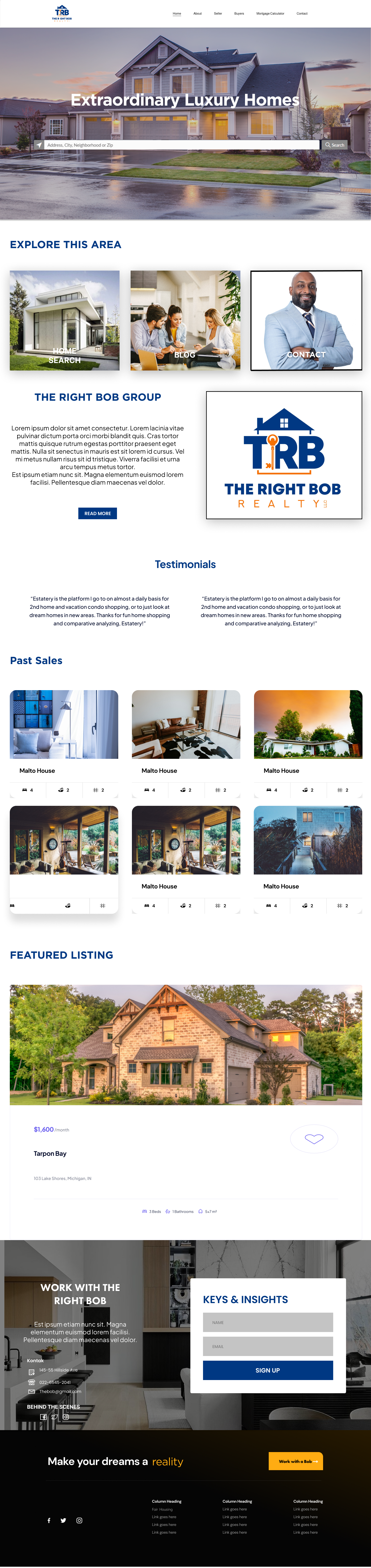

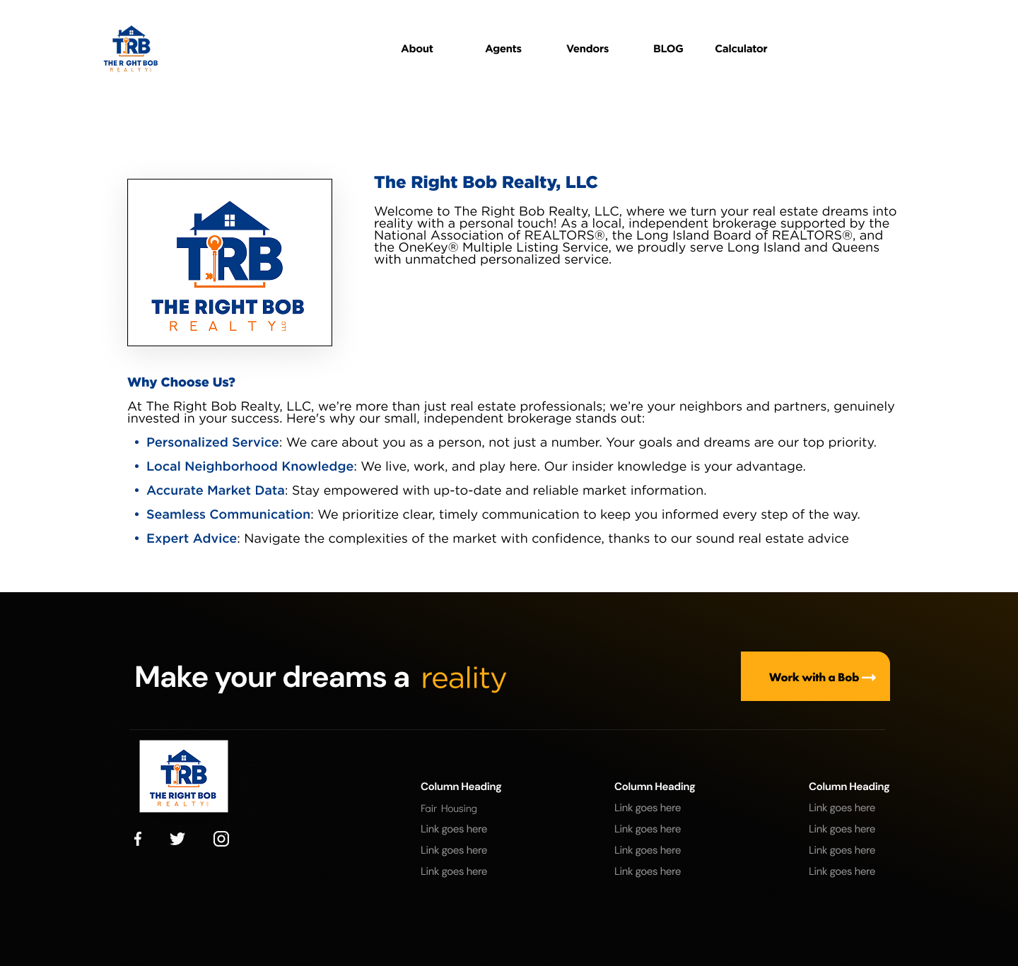
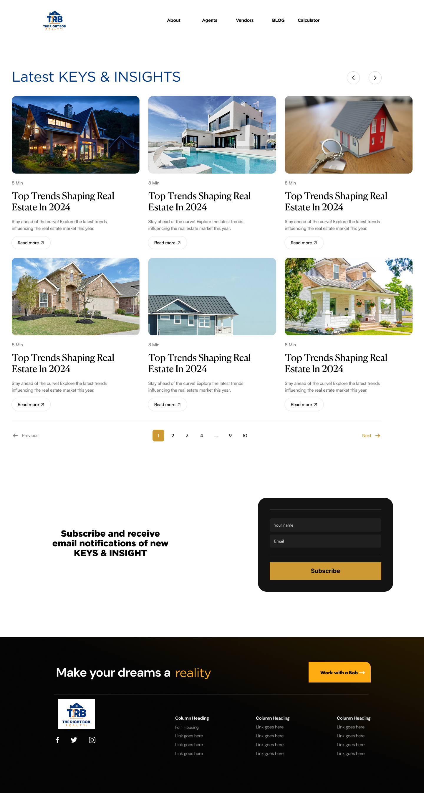
The finished product.
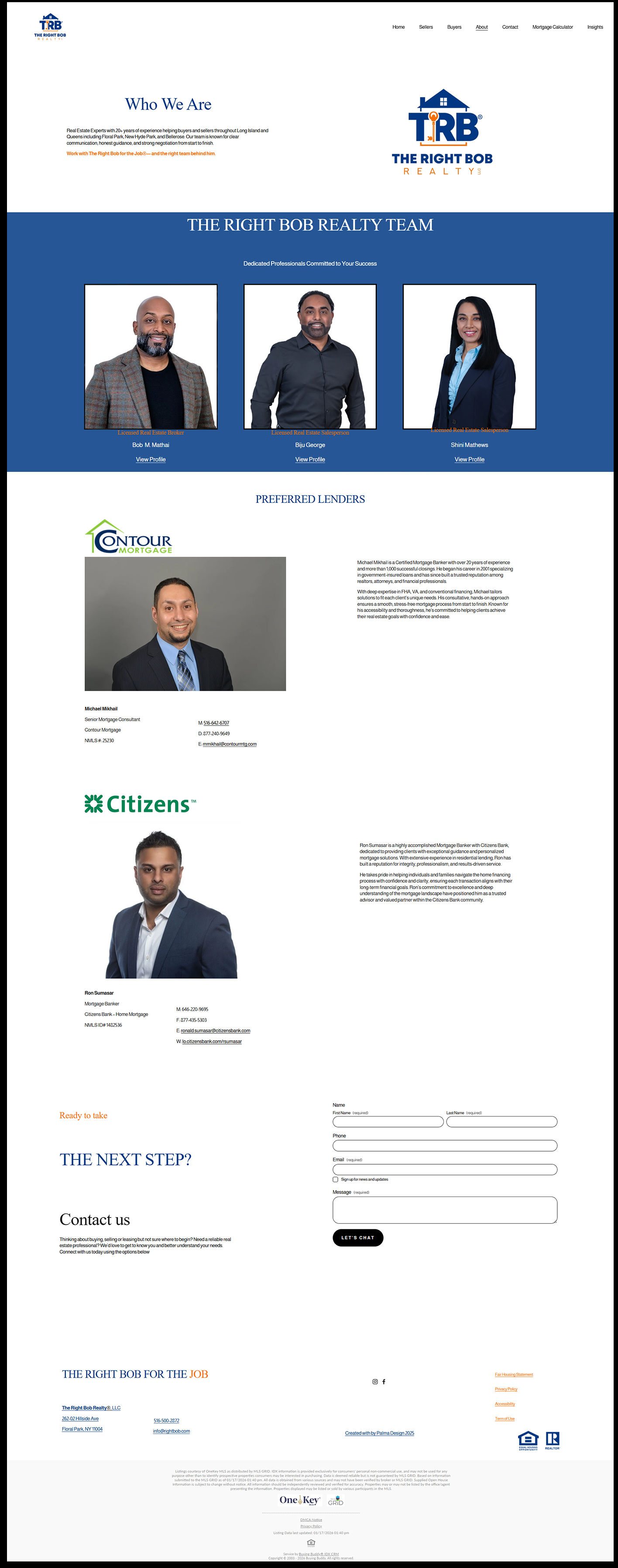
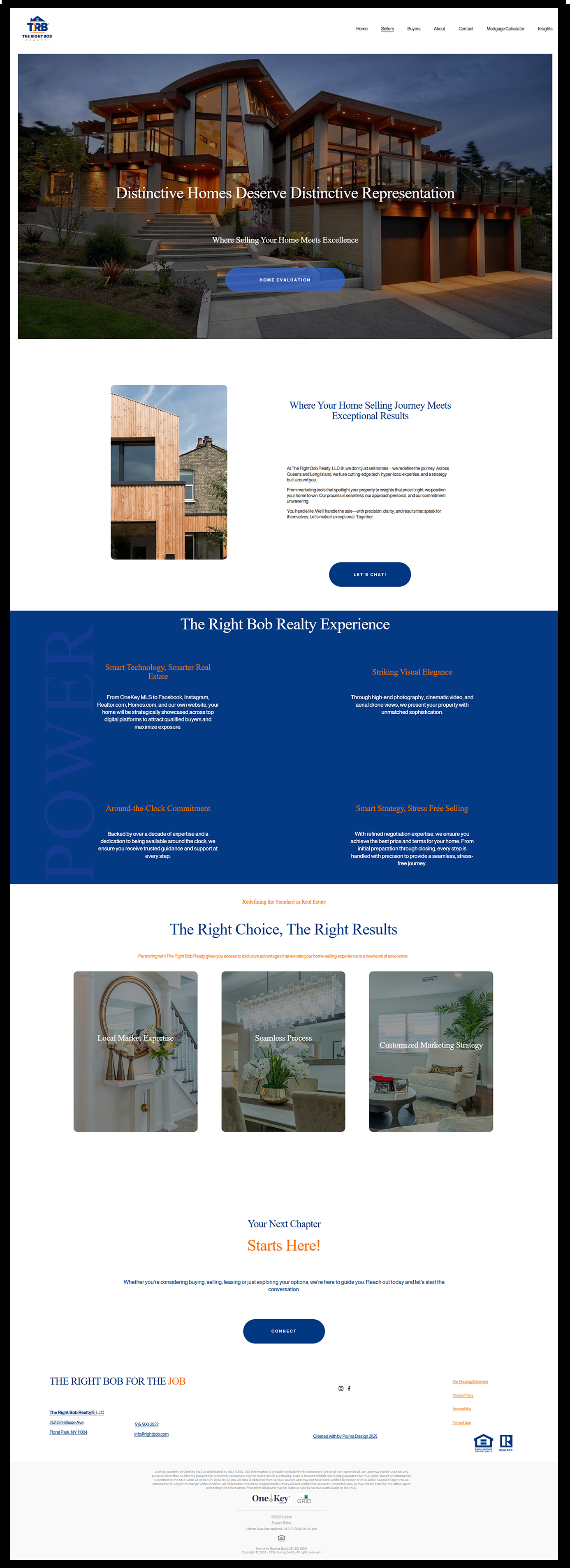
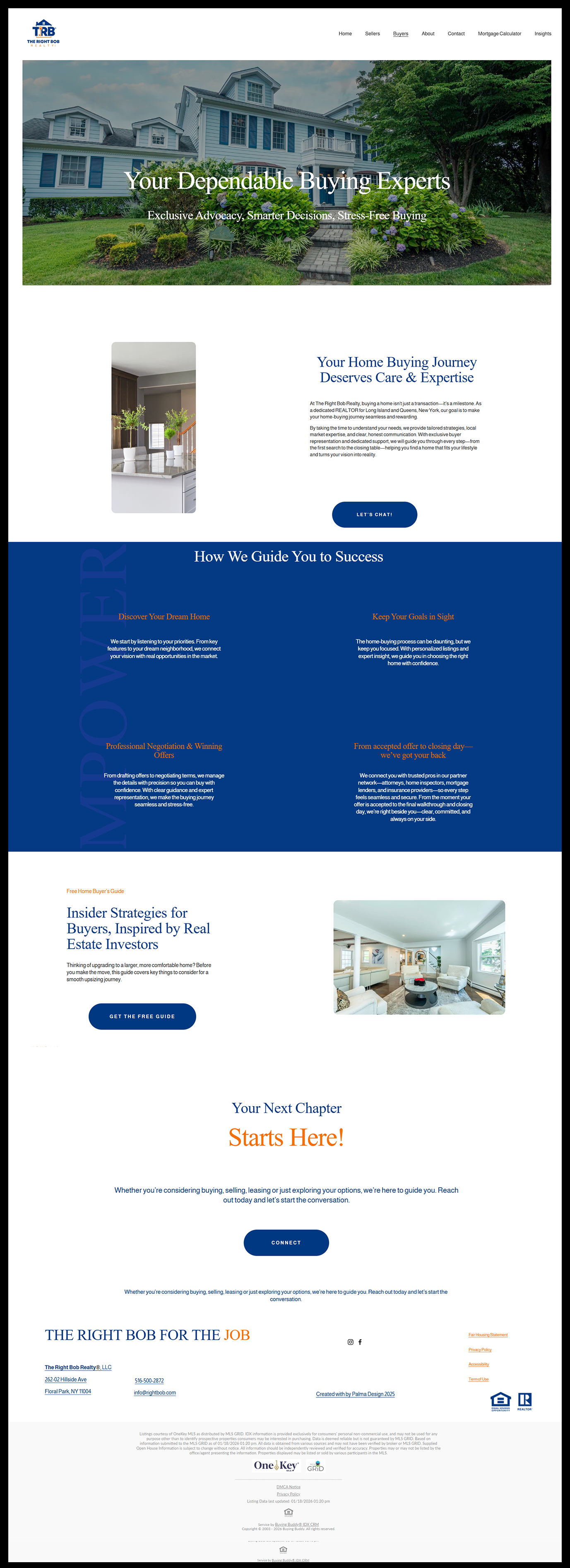
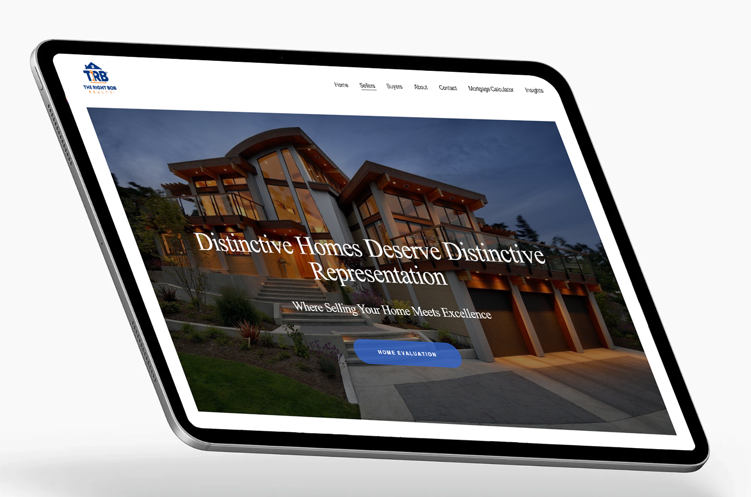
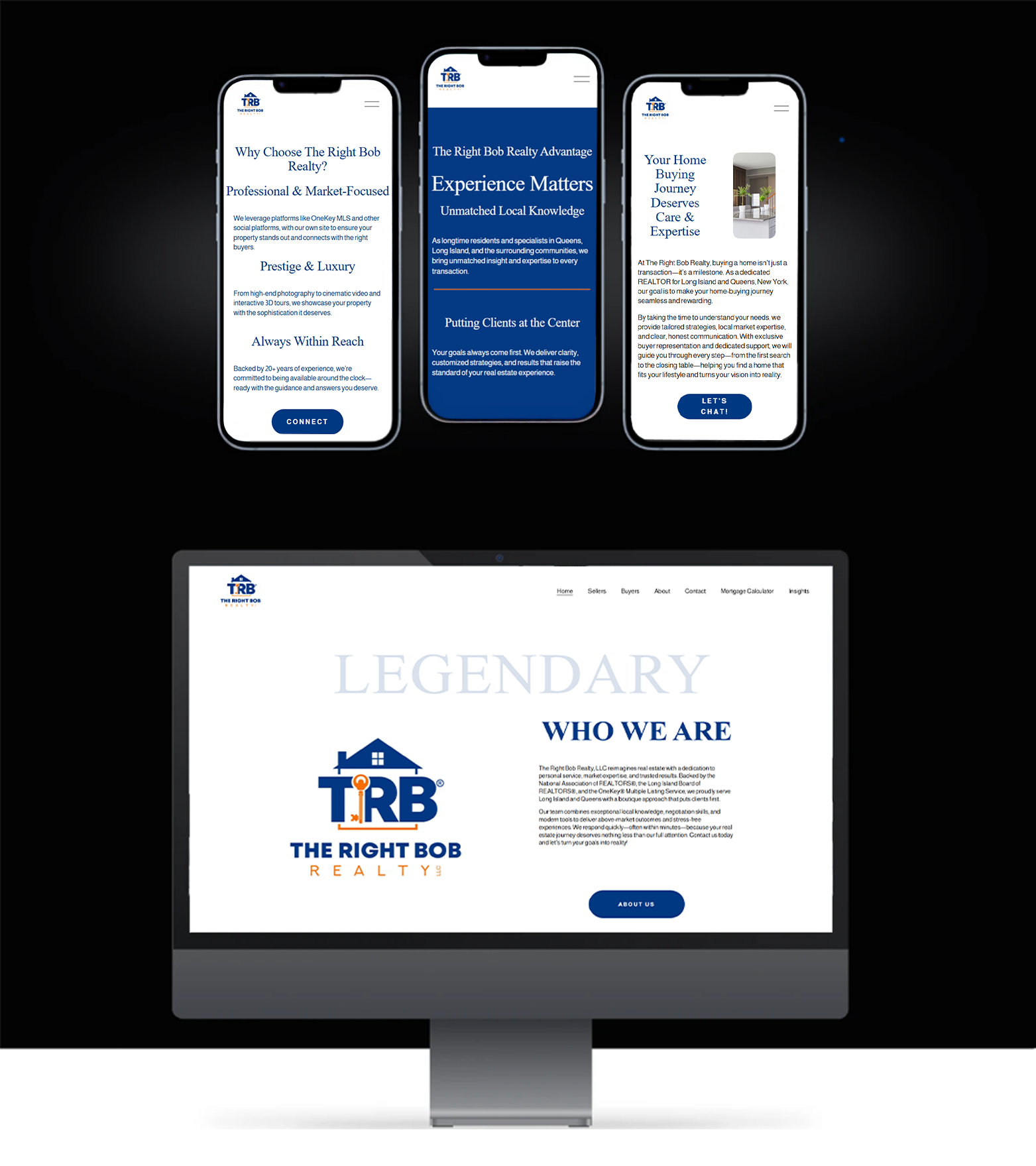
therightbob.com ↗Brand identity, user experience, and strategic structure unified into a cohesive, high-fidelity website — refined with real content, consistent visual language, and intentional hierarchy.

The Campaign
With the digital foundation set, the project expanded into a full creative campaign — extending the Right Bob brand into print, motion, and film.
Bringing the Brand to Life
Animated Commercial
A branded animated spot combining custom illustration and motion design to highlight The Right Bob's approachable, trustworthy image — built to perform across social and digital platforms.
Property Showcase Reel
A cinematic property video using drone footage and a compelling visual flow to elevate the agent's brand and professionally showcase the listing's best features to prospective buyers.
The Adventure
A lifestyle commercial built around the idea that homeowners can focus on living while The Right Bob handles the selling. Warm, relatable visuals position the brand as a reliable, stress-free partner.
Tri-fold Brochure
Designed to build trust and clearly communicate The Right Bob Realty's dedication to personalized, local service. Clean layouts, bold headers, and inviting imagery create a professional yet approachable feel — helping buyers and sellers instantly understand TRB's value and commitment to client success. Exported print-ready for both in-house and professional printing.
PDF Tri-fold ↗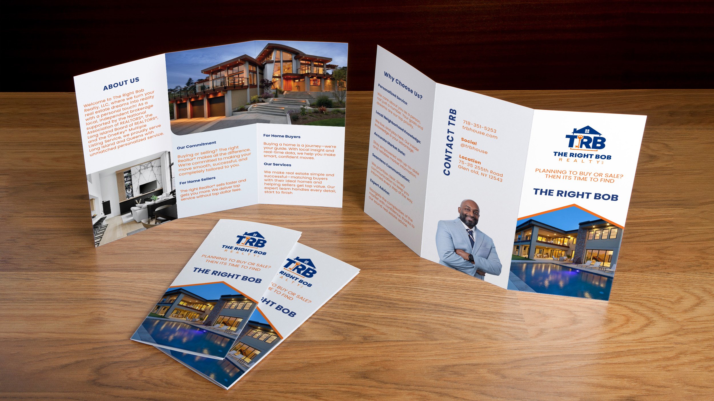


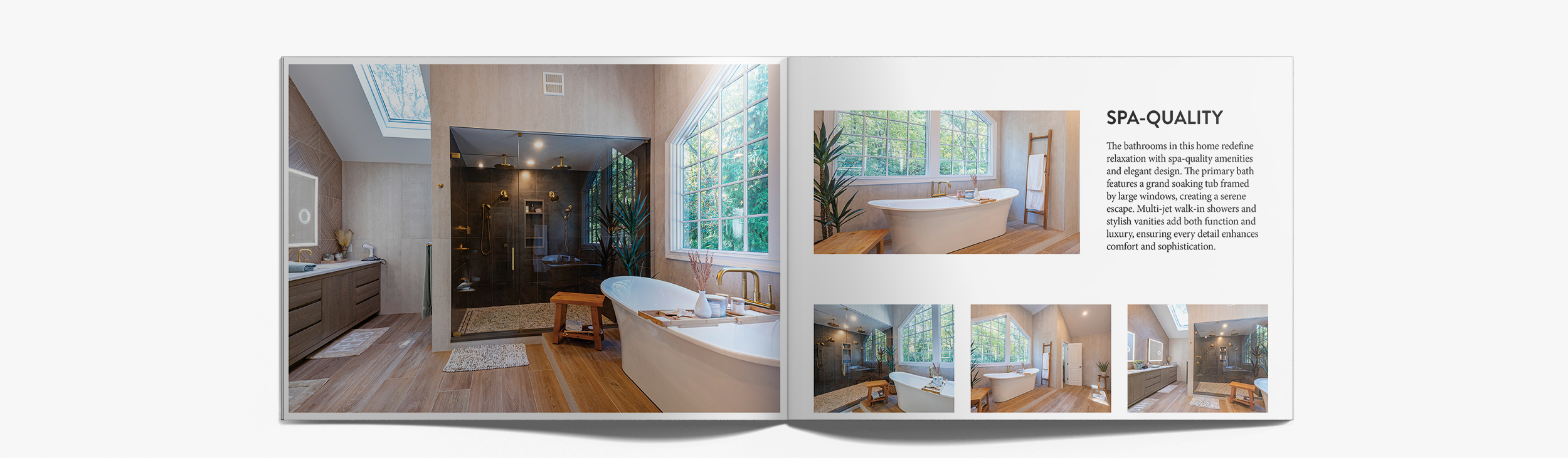
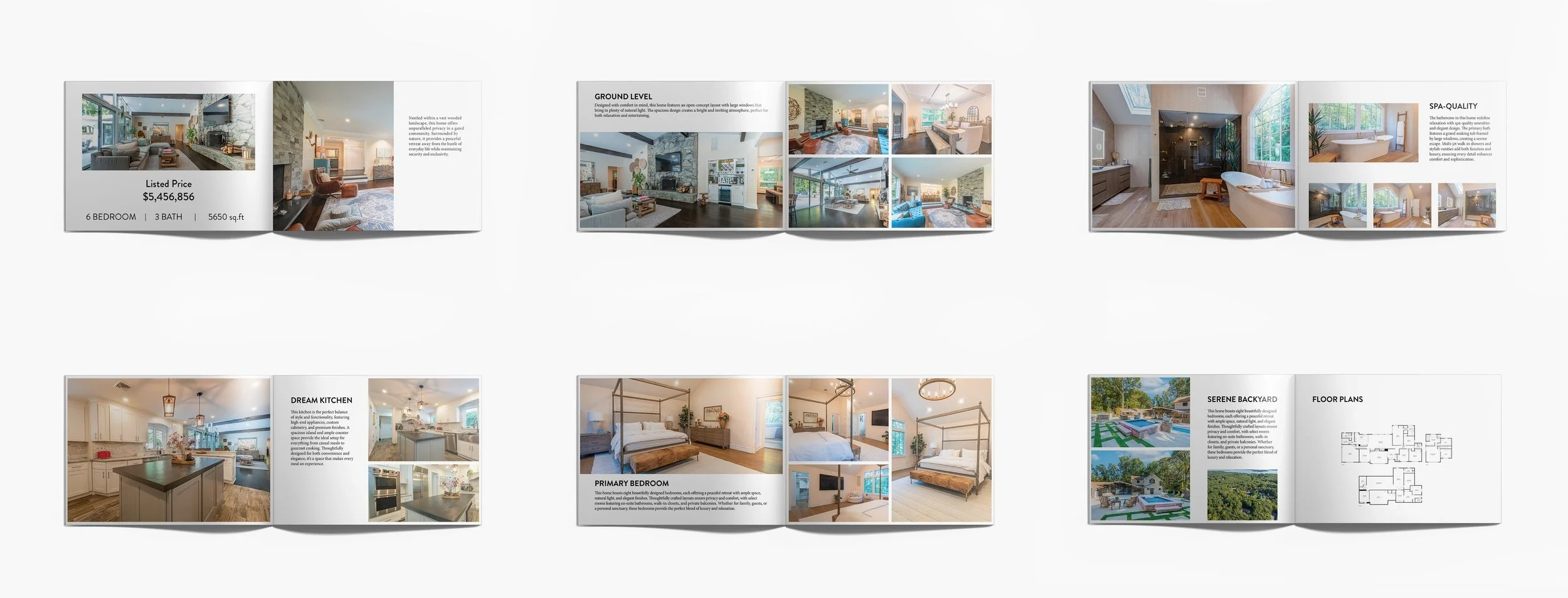
Property Catalog
A high-end property catalog designed to showcase The Right Bob Realty's latest luxury listing. The goal was to highlight the home's layout and architecture while providing clear, organized information about each room and unique property features — giving potential buyers a visually engaging and informative experience that reflects the premium quality of the listing.
The Outcome
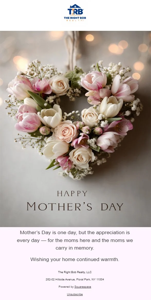
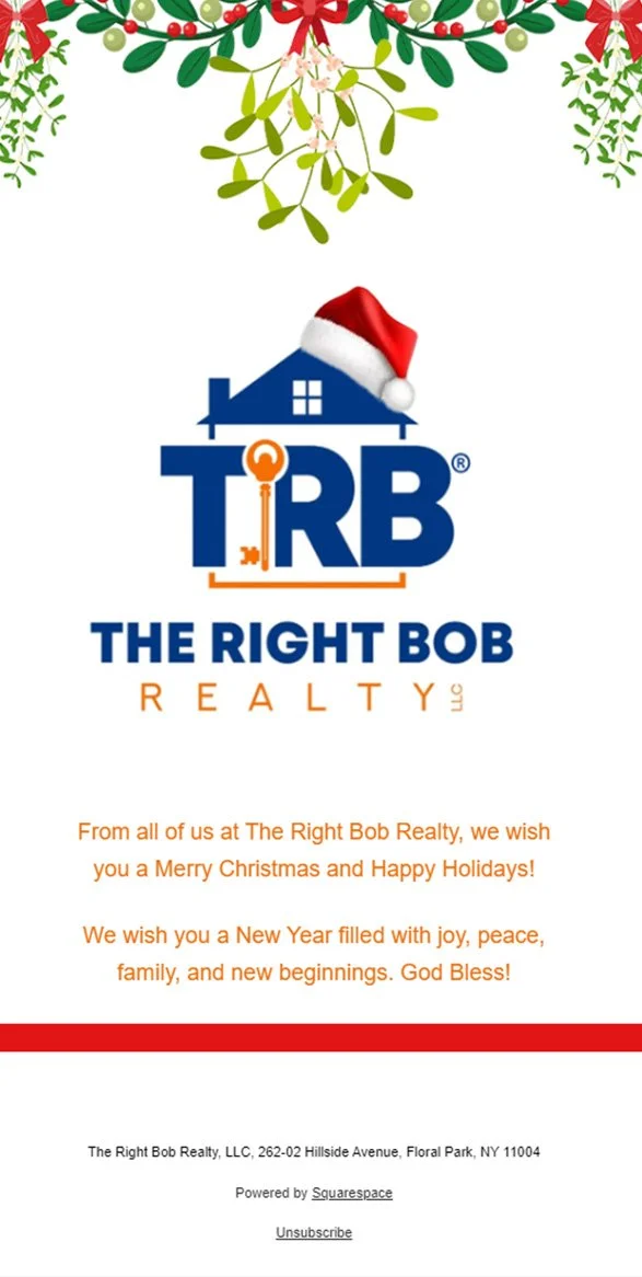
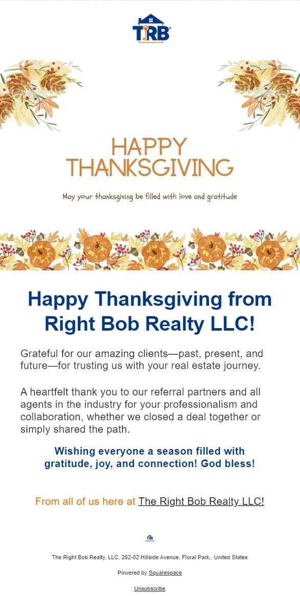
What started as a website redesign grew into a complete brand overhaul — giving The Right Bob Realty a cohesive visual identity across every touchpoint. From a fully custom website to animated commercials, print collateral, and seasonal campaigns, every piece was designed to build trust, increase visibility, and connect with clients in a meaningful way.
The engagement continues — currently serving as Brand & Marketing Designer on contract since March 2025, extending the visual language into new campaigns and creative directions as the brand grows.
An active, growing body of work — updated as the project evolves.
- —Custom Website · Squarespace
- —3 Video Productions
- —Tri-fold Brochure & Property Catalog
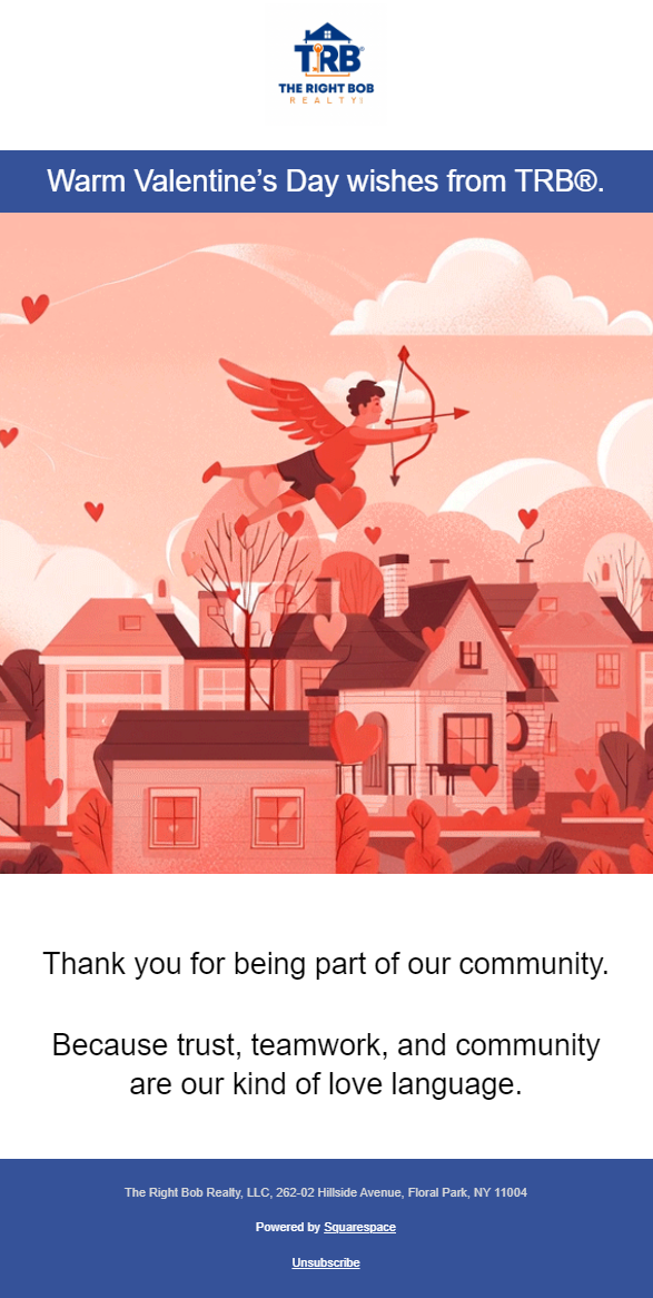
- —Email & Social Campaign · 4 Seasonal Touchpoints
- —Holiday Motion · Animation
- —Brand & Marketing · Ongoing