

Susan
Chen.
susan-chen.com ↗
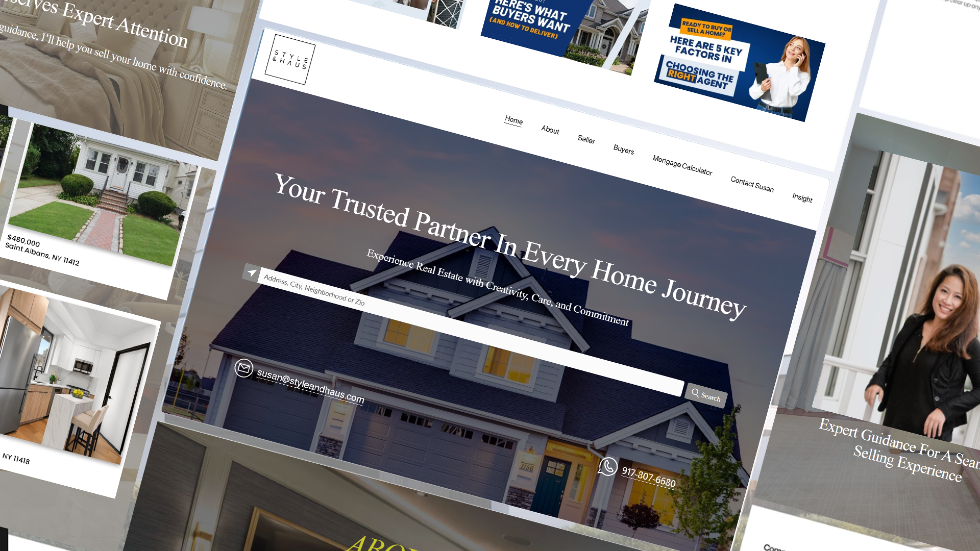
A complete redesign crafted to elevate brand perception, improve clarity, and drive user engagement. The goal was to transform a standard real estate site into a strategic, conversion-focused experience that clearly communicates services, builds trust, and guides visitors to key actions.
Guided by user needs and business objectives, the redesign focuses on streamlined navigation, purposeful content hierarchy, and clean visual storytelling to support both buyer and seller journeys.
A site working
against itself.
The old website needed a complete redesign due to its lack of functionality, poor search visibility, and outdated design. It failed to engage visitors or generate leads, ultimately hurting the brand's credibility in a competitive digital market.
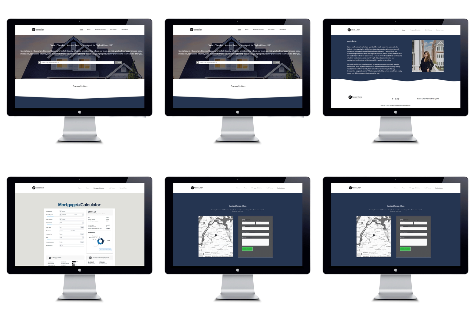 Original site — before redesign
Mapping the structure.
Before a single screen was designed, the site's architecture was mapped out to establish a clear, logical foundation — organizing navigation and subpages to ensure content is purposeful, easy to find, and optimized for lead generation.
 Site map — page hierarchy & user flow
With the site map as a guide, wireframes were developed to visualize the layout, hierarchy, and user flow before adding any visual design. The focus was on clear navigation, strategic placement of calls-to-action, and content organization that drives engagement and conversions.
The color palette reflects luxury, trust, and modern sophistication. White represents clarity and minimalism, the warm gold tone conveys prestige and success, and the deep black grounds the palette with confidence and authority. Together they position the brand as refined, timeless, and high-value.
C 0 · M 0 · Y 0 · K 0
C 18 · M 28 · Y 95 · K 1
C 75 · M 68 · Y 63 · K 90
Two typefaces were selected to balance heritage and modern clarity — each serving a distinct role in the brand's visual language.
nopqrstuvwxyz
nopqrstuvwxyz
Bringing it to life.
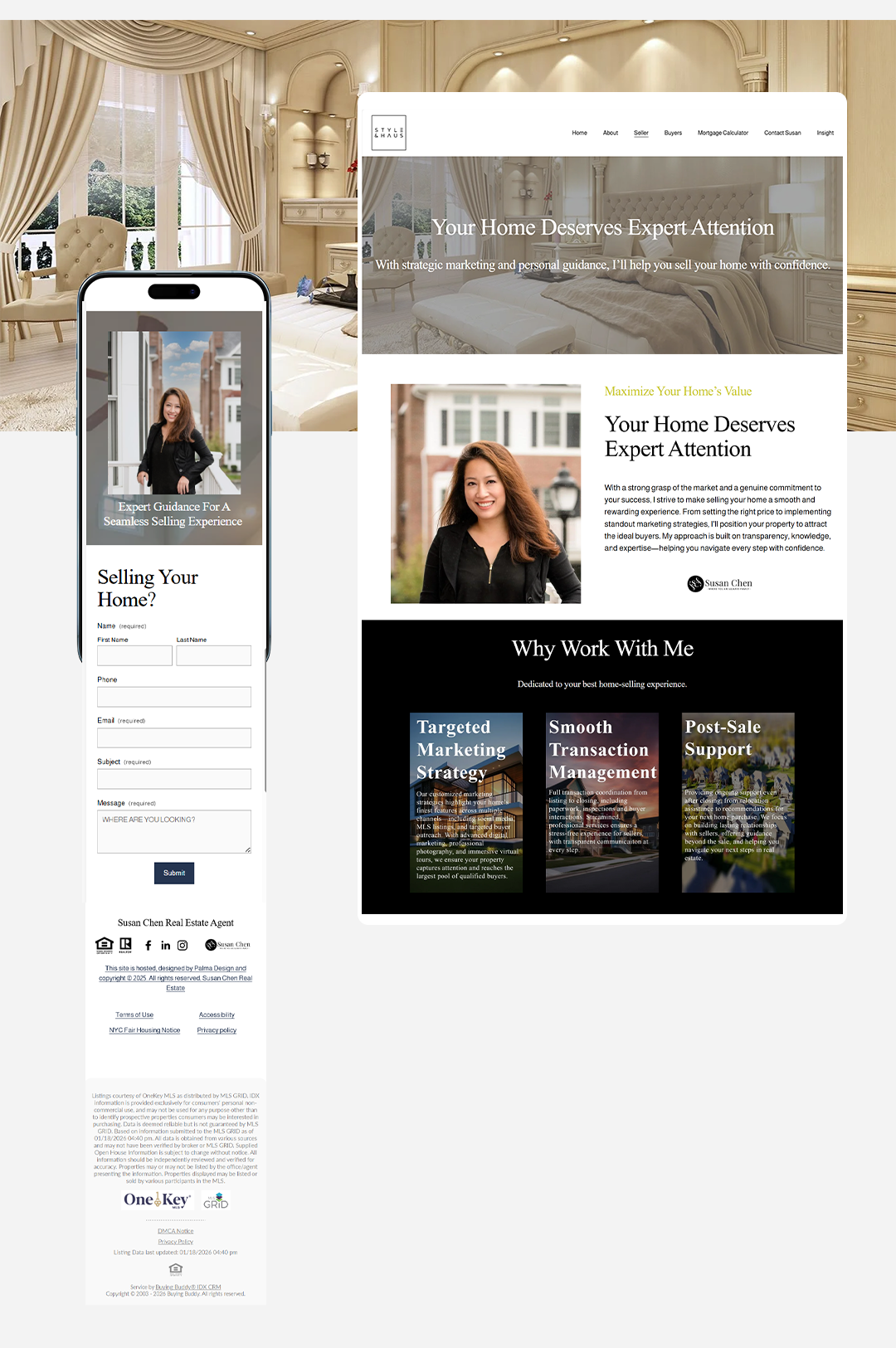
Brand colors, typography, and real imagery applied to the structural framework — exploring layout, hierarchy, and interaction in a more realistic context before the final version is produced.


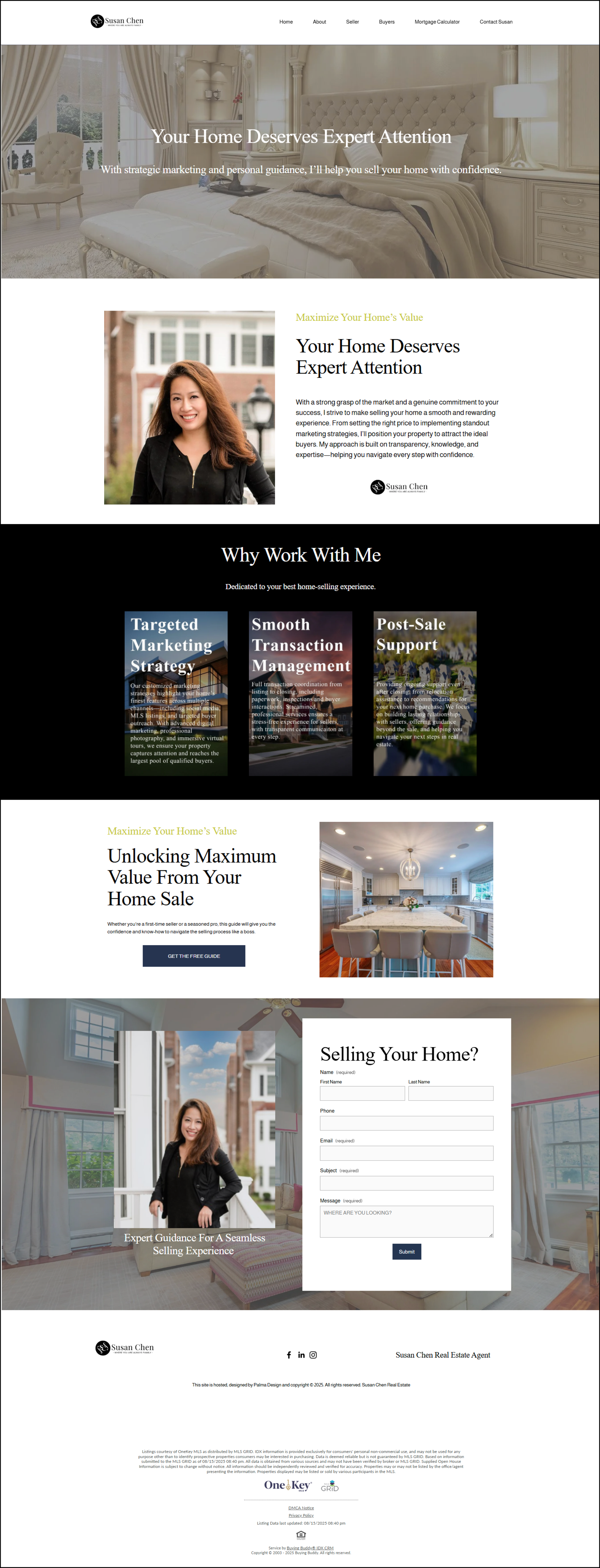
The finished product.
susan-chen.com ↗Brand identity, user experience, and strategic structure unified into a cohesive, high-fidelity website — refined with real content, consistent visual language, and intentional hierarchy.


After the website redesign, analytics showed a significant improvement in overall traffic and visibility — reflecting stronger content hierarchy, improved navigation, and clearer user pathways.
on Page
Rate
Rate
The redesigned website led to stronger engagement and clearer navigation patterns. Visitors spent more time on pages and explored deeper into the site — signs of improved usability and content flow.
Traffic growth confirmed the redesign's structural improvements — better content hierarchy and navigation directly translated into stronger organic discoverability and repeat visits.
Engagement data revealed that users arriving on the site were spending meaningful time with content — a clear indicator that the visual hierarchy and page flow were working as intended.
What I learned.
This redesign reinforced the importance of leading with strategy before design. By mapping the site structure first and grounding every decision in user flow, the final product felt intentional rather than decorative. Post-launch data confirmed the approach — users explored more, stayed longer, and engaged more deeply than on the original site. The project also revealed how much brand perception shifts when typography, hierarchy, and imagery work together as a system rather than as individual elements.
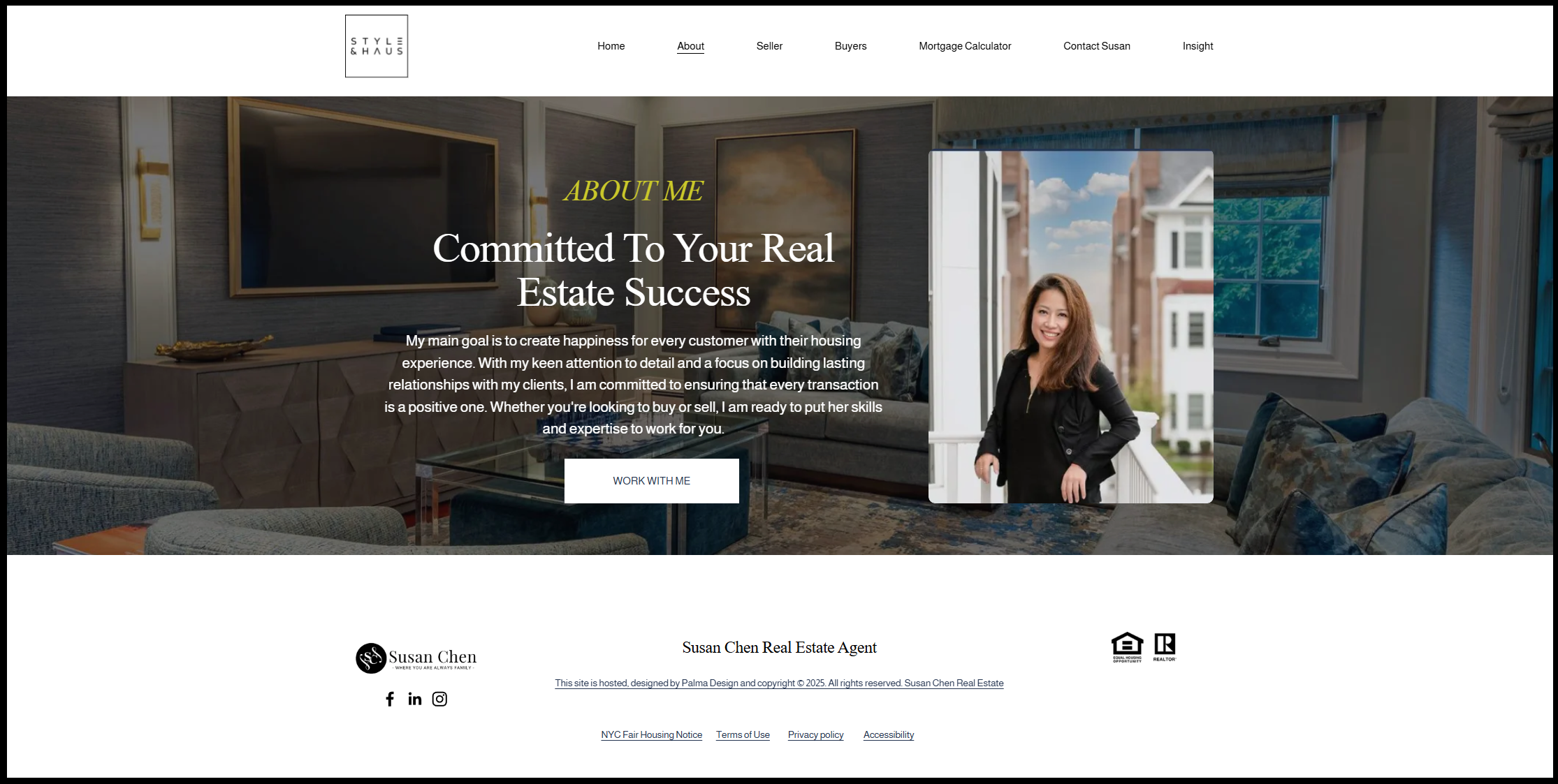
Try the prototype.
Experience the interactive prototype directly here, or follow the link below to view it in Figma. Click through the design, test navigation, and see how the final website functions in a real-world flow.